CSS
Introduction
CSS is the language used to lay out and format web pages and other media. It is one of the three main languages of the web, joining HTML, which is used for structure, and JavaScript for behavior.
The past few years have seen a flurry of new CSS features. Many of these have taken inspiration from things developers were already doing with JavaScript or in preprocessors, while others provide methods of doing things that were impossible a few years ago. Having new features available is one thing, but are developers actually using them in their production web pages and applications? It is this question we will try to answer with data.
In this chapter, we use the data to find out what developers actually use in production, rather than the features most talked about on Twitter, showcased at conferences, or found in clever demos. We can see which of the new features are being adopted, which old techniques are falling out of use, and the legacy techniques that are stubbornly remaining in our stylesheets.
Usage
Each year, we see that CSS grows in size, and 2022 was no exception.
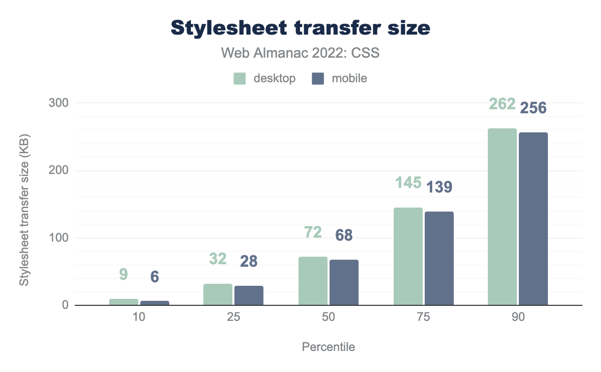
Other than the 25th percentile, which dropped a percentage point, each percentile showed a small increase in size. At the 90th percentile the increase was almost 7%, a similar increase to that seen between 2020 and 2021. Mobile stylesheets remain slightly smaller than those served to desktop.
The desktop page with the greatest CSS weight was slightly smaller than last year at 62,631 KB. The largest mobile stylesheet had risen from 17,823 KB to 78,543 KB—thankfully this was an exception.
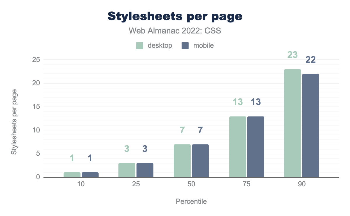
The number of stylesheets per page has remained almost identical to 2021, with an increase of one for mobile at the 50th percentile.
Last year the record was broken for the number of stylesheets loaded by a single page at 2,368. This year we found one site loading 1,387 stylesheets on mobile, still a significant amount.
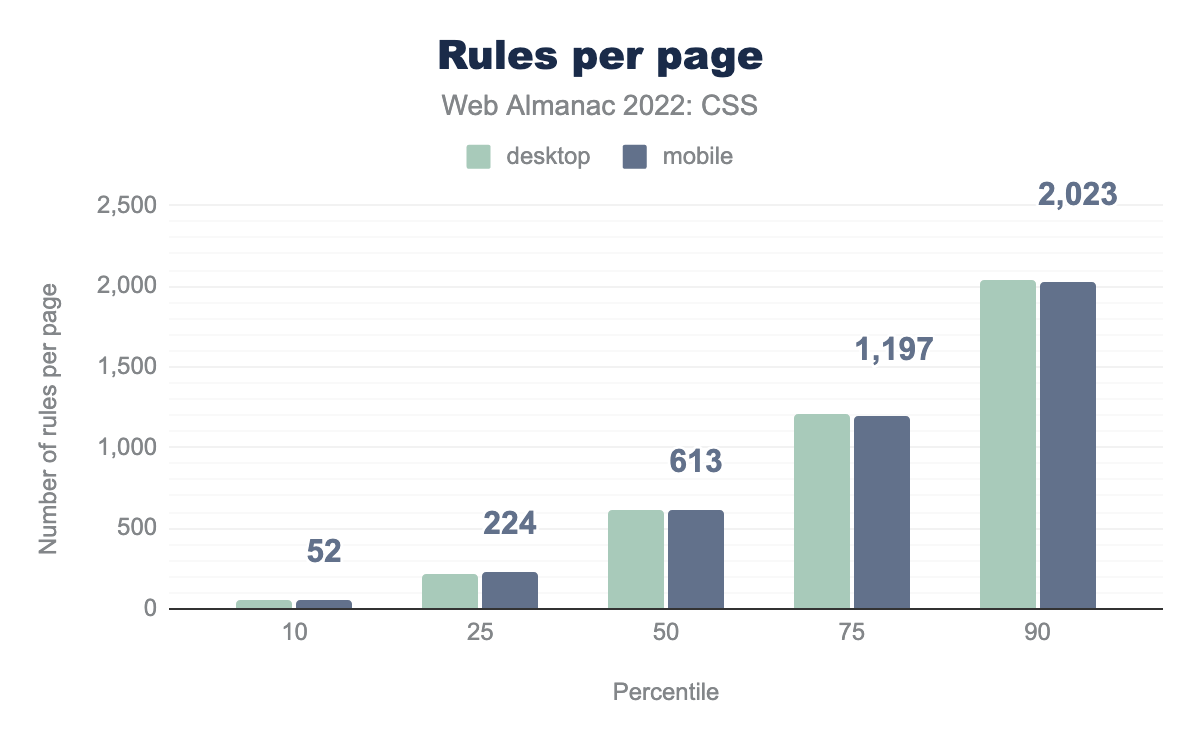
Taking a look at the number of style rules in a page showed an increase across all percentiles; the lower percentiles showing more rules for mobile, the higher percentiles more for desktop. These increases are substantial. Desktop rules for the 50th percentile increased by 130 rules, and the 90th percentile by 202.
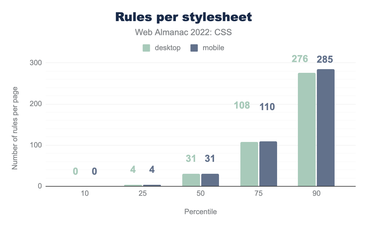
We can see from the total number of stylesheets loaded, that typically people are breaking their CSS down into multiple stylesheets. At the 50th percentile this works out as 31 rules per stylesheet, growing to 276 rules on desktop and 285 rules for mobile at the 90th percentile.
Selectors and the cascade
2022 saw a shake-up with regard to the cascade with @layer landing in all engines. This new at-rule enables the grouping of selectors into layers, the order of precedence of the layers can then be managed.
It’s a little early to see widespread usage of this new method of managing the cascade, but let’s take a look at how selector usage has evolved.
Class names
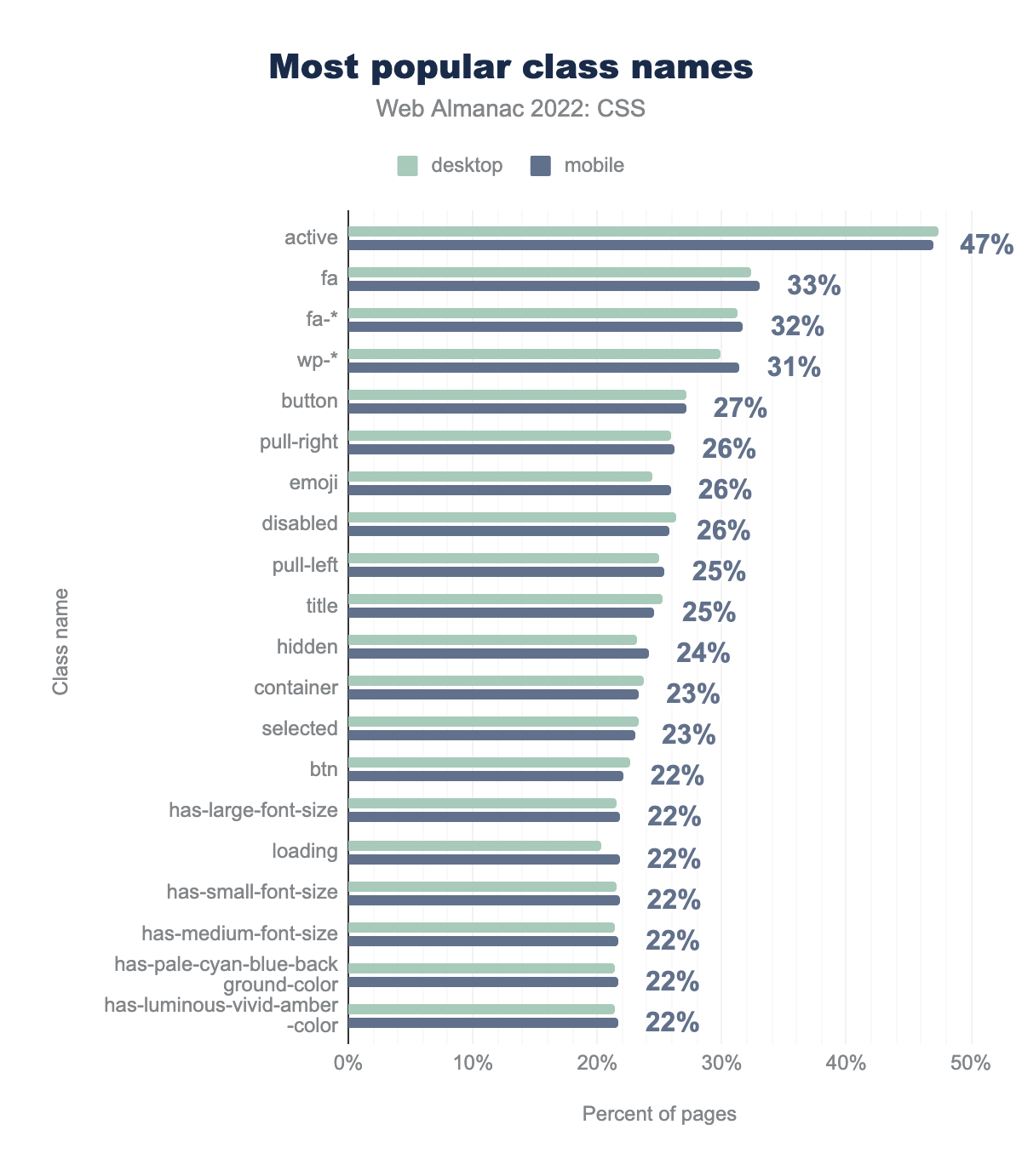
active at 47% of pages. Next is fa on 33% of pages, other classes prefixed with fa on 32%, and classes prefixed with wp on 31%. The rest of the top 10 classes in descending order are: button with 27% adoption, pull-right, emoji, and disabled at 26%, and finally pull-left and title at 25%.As in 2020 and 2021 the most popular class name on the web is active. The fa, fa-* prefixes for Font Awesome still coming second and third. However, wp-* class names have crept up the rankings, moving to fourth place. They now show up on 31% of pages, having been at 20% in 2021. We also see class names such as has-large-font-size appearing, these are used in the new WordPress Block Editor.
clearfix has disappeared from the top 20, it is now found on only 10% of pages, a very clear indication that float-based layouts are vanishing from the web.
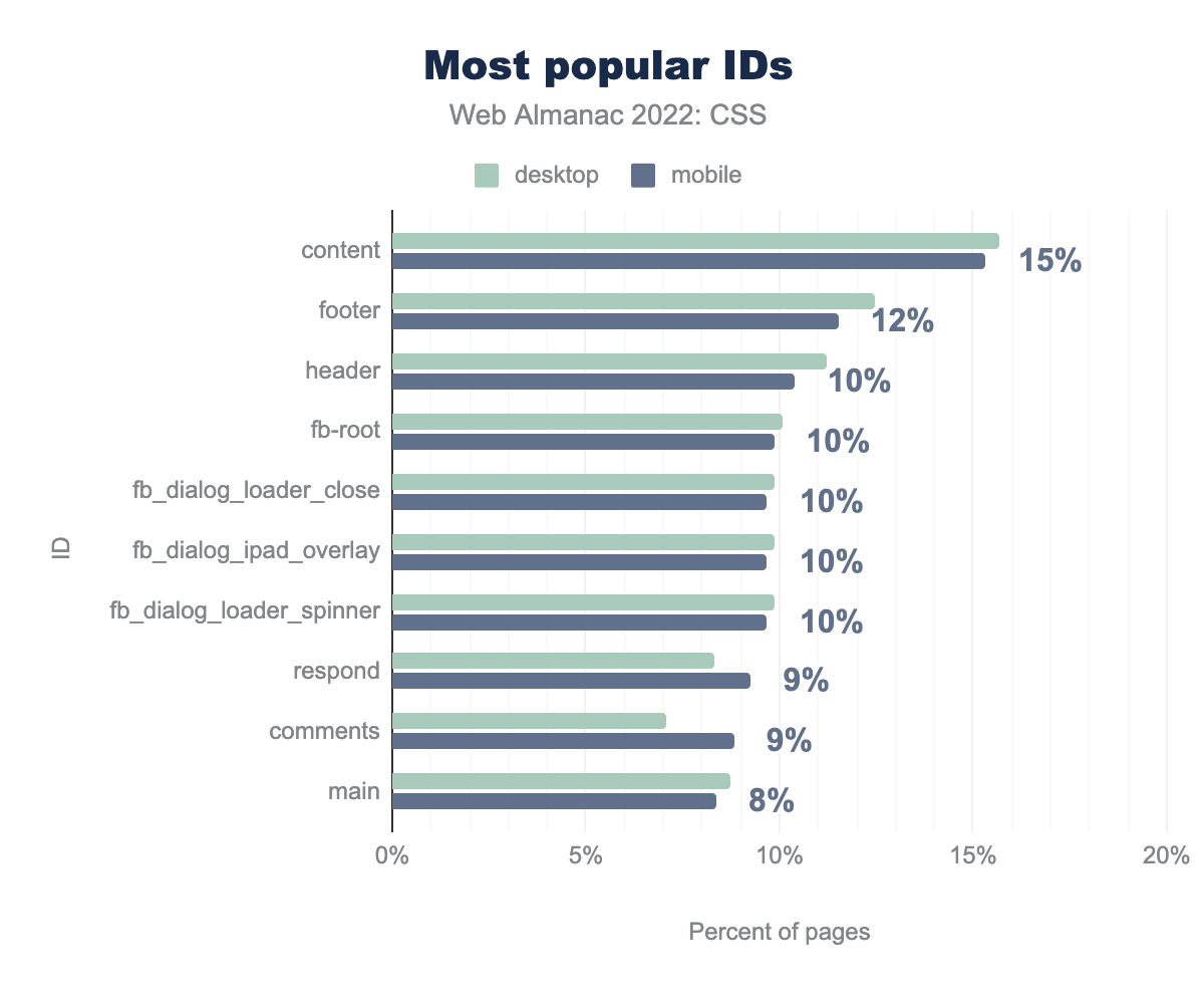
content is used on 15% of pages, followed by footer on 12%, header, fb-root, fb_dialog_loader_close, fb_dialog_ipad_overlay, and fb_dialog_loader_spinner all on 10%, then respond and comments on 9%, and finally main on 8% of pages.The name content is once again the most popular ID name, followed by footer, and header. The IDs starting with fb_ indicate use of Facebook widgets. In 2021 IDs beginning with rc-, indicating use of Google’s reCAPTCHA system were seen on 7% of pages, and are still seen with the same frequency, despite being pushed out of the top ten by the Facebook ID names.
!important
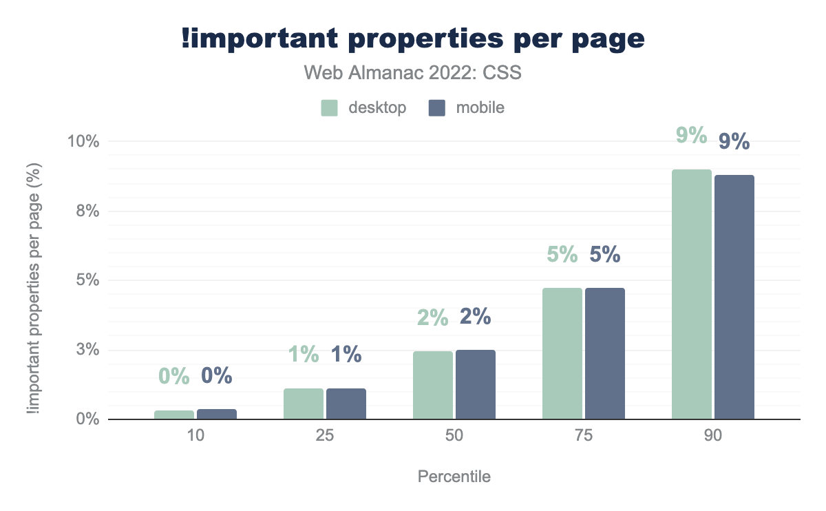
!important properties used per page. On mobile pages, the values are 0%, 1%, 2%, 5%, and 9%, respectively. Desktop values are the same.!important properties per page.
The use of !important has slightly increased for the top two percentiles this year. As @layer usage takes hold, it will be interesting to see how this impacts the use of this property, typically used to deal with specificity issues.
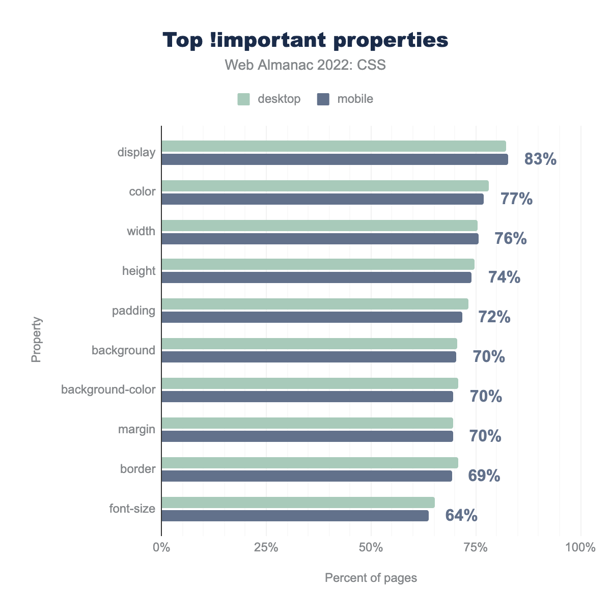
!important. For mobile pages, the values are display on 83% of pages, color on 77%, width on 76%, height on 74%, padding on 72%, background, background-color, and margin each on 70%, border on 69%, and finally font-size on 64%.!important is applied to by percent of pages.
In terms of what !important is applied to, the top properties remain unchanged. However, position has fallen out of the top ten, to be replaced with font-size.
Selector specificity
| Percentile | Desktop | Mobile |
|---|---|---|
| 10 | 0,1,0 | 0,1,0 |
| 25 | 0,1,2 | 0,1,3 |
| 50 | 0,2,0 | 0,2,0 |
| 75 | 0,2,0 | 0,2,0 |
| 90 | 0,3,0 | 0,3,0 |
Except for desktop at the 25th percentile, median specificity values are exactly the same as last year, remaining constant over the past two years. These values indicate the flattened specificity created by methodologies such as BEM.
Pseudo-classes and -elements
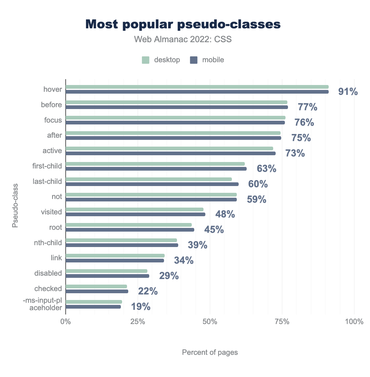
hover on 91%, before on 77%, focus on 76%, after on 75%, active on 73%, first-child on 63%, last-child on 60%, not on 59%, after which the popularity drops quickly with visited on 48%, root on 45%, nth-child on 39%, link on 34%, disabled on 29%, checked on 22%, and finally -ms-input-placeholder on 19%.Once again the user-action pseudo-classes :hover, :focus, and :active are in the top three spots. The negation pseudo-class :not() also continues its rise in popularity, along with :root, likely used to create custom properties.
Last year it was noted that :focus-visible, a way to style elements in focus in a way that better matches user expectations, appeared in less than 1% of pages. The property has been available in all three major engines since March 2022, and is now found on 10% of desktop and 9% of mobile pages.
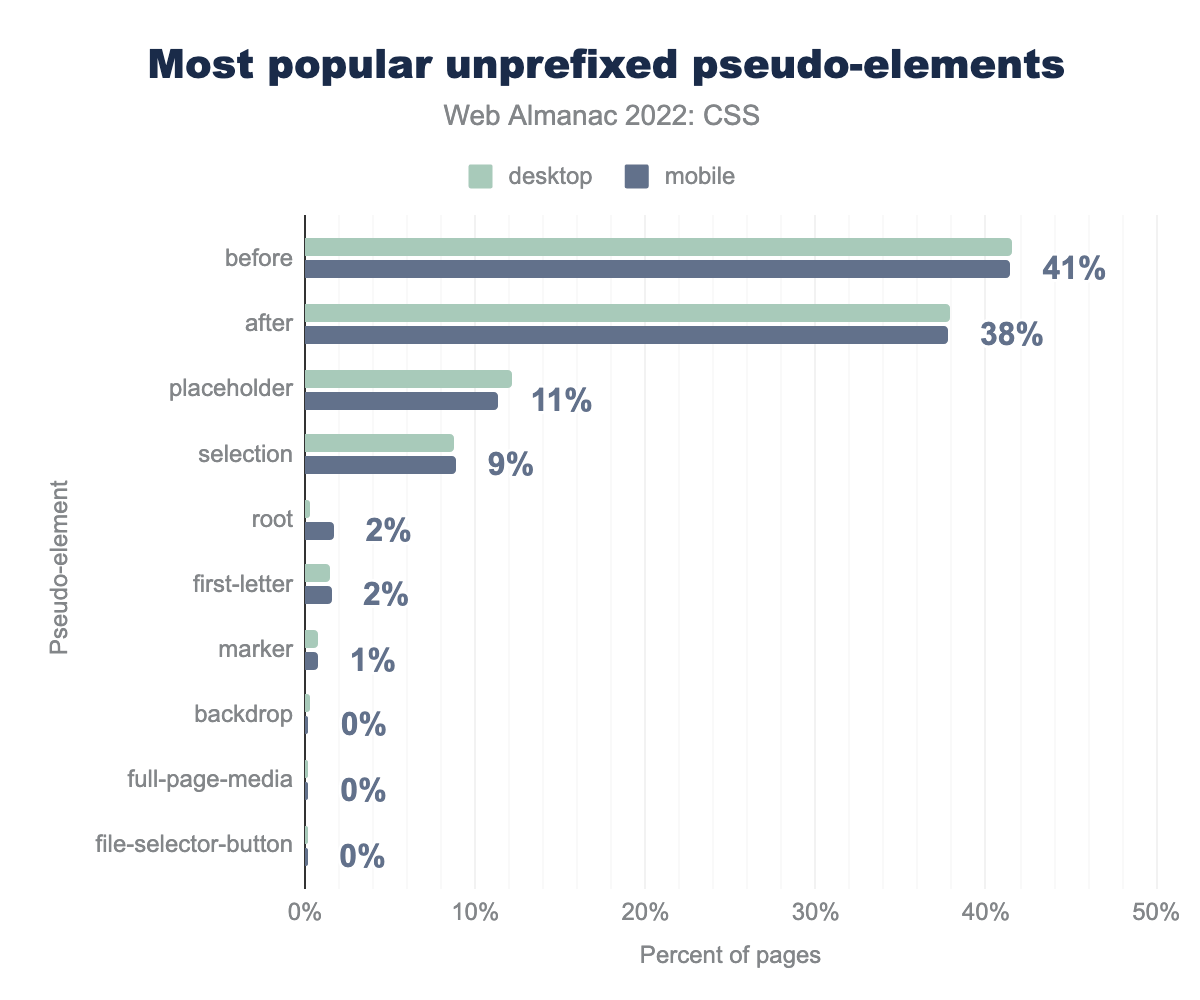
before on 41%, after on 38%, placeholder on 11%, selection on 9%, root and first-letter both on 2%, marker on 1%, and finally backdrop, full-page-media, and file-selector-button barely registering less than 1% of pages.We filter out any prefixed, and therefore browser-specific, pseudo-elements. These are typically used to select interface components or parts of browser chrome, and we are interested in the pseudo-elements developers are actually using.
The use of ::before and ::after has increased since last year. These are used to insert generated content into the document. By checking usage of the content property, it is possible to see that this is most often being used to insert an empty string, used for styling purposes. Generated content is one way to style a grid area without needing to add an element; perhaps this has contributed to the rise in usage of these properties?
Use of the ::marker pseudo-element has now made 1%, showing that people are slowly starting to take advantage of the ability to select and style list markers.
Attribute selectors
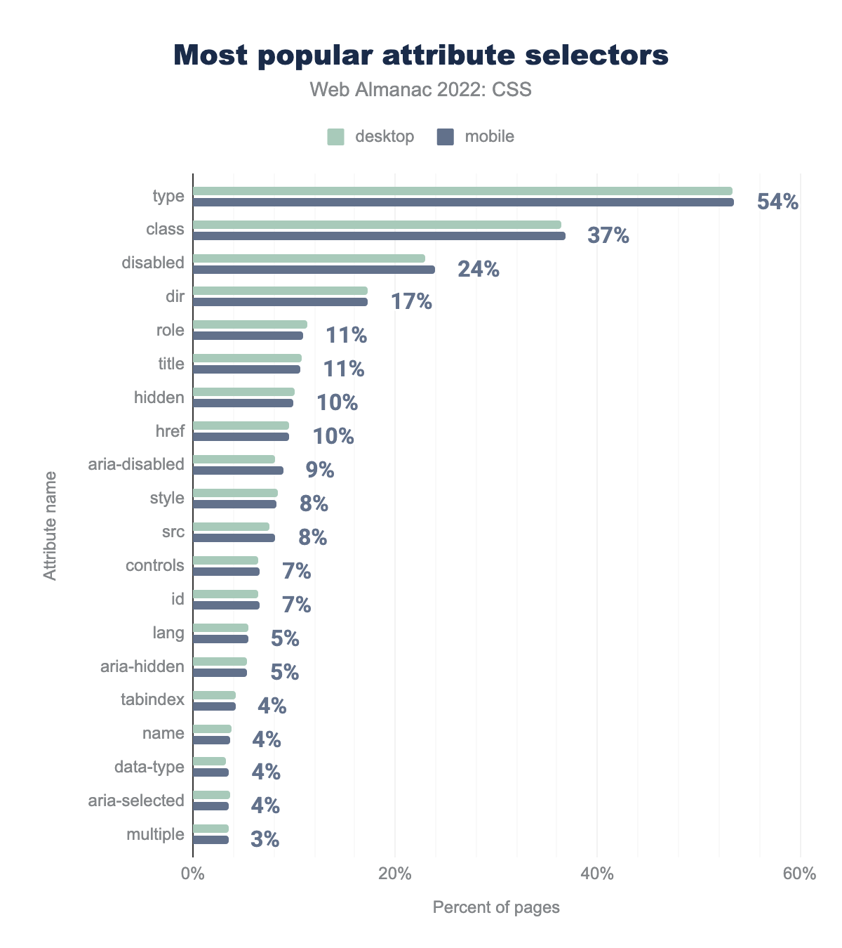
type used on 54% of pages, then class on 37%, disabled on 24%, dir on 17%, role and title on 11%, hidden and href on 10%, aria-disabled on 9%, style and src on 8%, controls and id on 7%, lang and aria-hidden on 5%, followed by tabindex, name, data-type, and aria-selected all on 4%, and finally multiple on 3% of pages.The most popular attribute selector is type, found on 54% of pages. The next most popular attribute selectors are class on 37%, disabled on 25%, and dir on 17% of pages.
Values and Units
CSS provides multiple ways to specify values and units, either in set lengths, or calculations based on global keywords.
Length
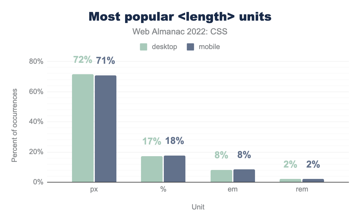
px), used on 71% of pages, followed by percentage (%) on 18%, em on 8%, and rem on 2%.<length> units by percent of pages.
Pixel lengths remain the most popular at 71%, the same percentage as in 2021. The spread of usage remains roughly the same too.
| Property | px |
<number> |
em |
% |
rem |
pt |
|---|---|---|---|---|---|---|
| font-size | (▲2%) 71% | 2% | (▼1%) 15% | 5% | (▲1%) 6% | (▼1%) 2% |
| border-radius | (▼1%) 64% | (▼1%) 20% | 3.13% | (▲1%) 11% | (▲2%) 2% | 0% |
| line-height | (▼5%) 49% | (▲4%) 35% | 12.94% | (▼1%) 2% | (▲1%) 1% | 0% |
| border | (▼1%) 70% | 28% | 2% | 0% | 0% | 0% |
| text-indent | (▼5%) 26% | (▲13%) 65% | (▼4%) 5% | (▼3%) 5% | 0% | 0% |
| vertical-align | (▼26%) 3% | (▼9%) 3% | (▲39%) 94% | 0% | 0% | 0% |
| gap | (▲4%) 25% | (▼6%) 10% | (▲32%) 33% | 0% | (▼31%) 32% | 0% |
| margin-inline-start | (▼31%) 7% | (▲3%) 49% | (▲30%) 44% | 0% | 0% | 0% |
| grid-gap | (▲5%) 68% | (▼1%) 10% | (▼2%) 7% | 0% | (▼1%) 15% | 0% |
| margin-block-end | (▼1%) 3% | (▲54%) 85% | (▼53%) 12% | 0% | 0% | 0% |
| padding-inline-start | (▼4%) 29% | (▲11%) 16% | (▼10%) 53% | 0% | (▲3%) 3% | 0% |
| mask-position | (▲1%) 1% | (▲3%) 3% | (▼14%) 36% | (▲10%) 60% | 0% | 0% |
The up and down arrows on this chart show the change from the results in 2021. As seen last year, in the majority of cases there is a shift away from using pixels, in favor of other length units. Once again, the vertical-align property saw a huge drop in pixel and <number> use, and a large rise in em use.
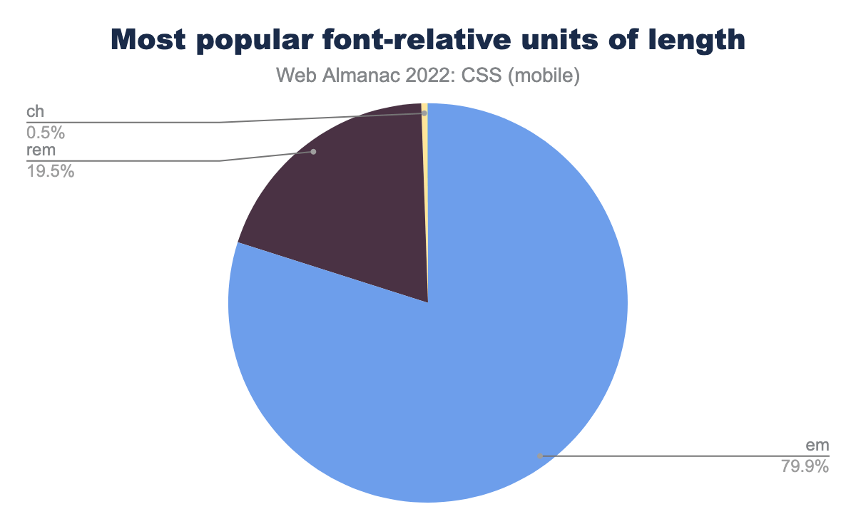
em makes up 79.9% of occurrences, rem on 19.5%, and ch on 0.5%.While em remains the most popular method of sizing fonts, the swing to rem continues with a small (just under two point) increase over last year.
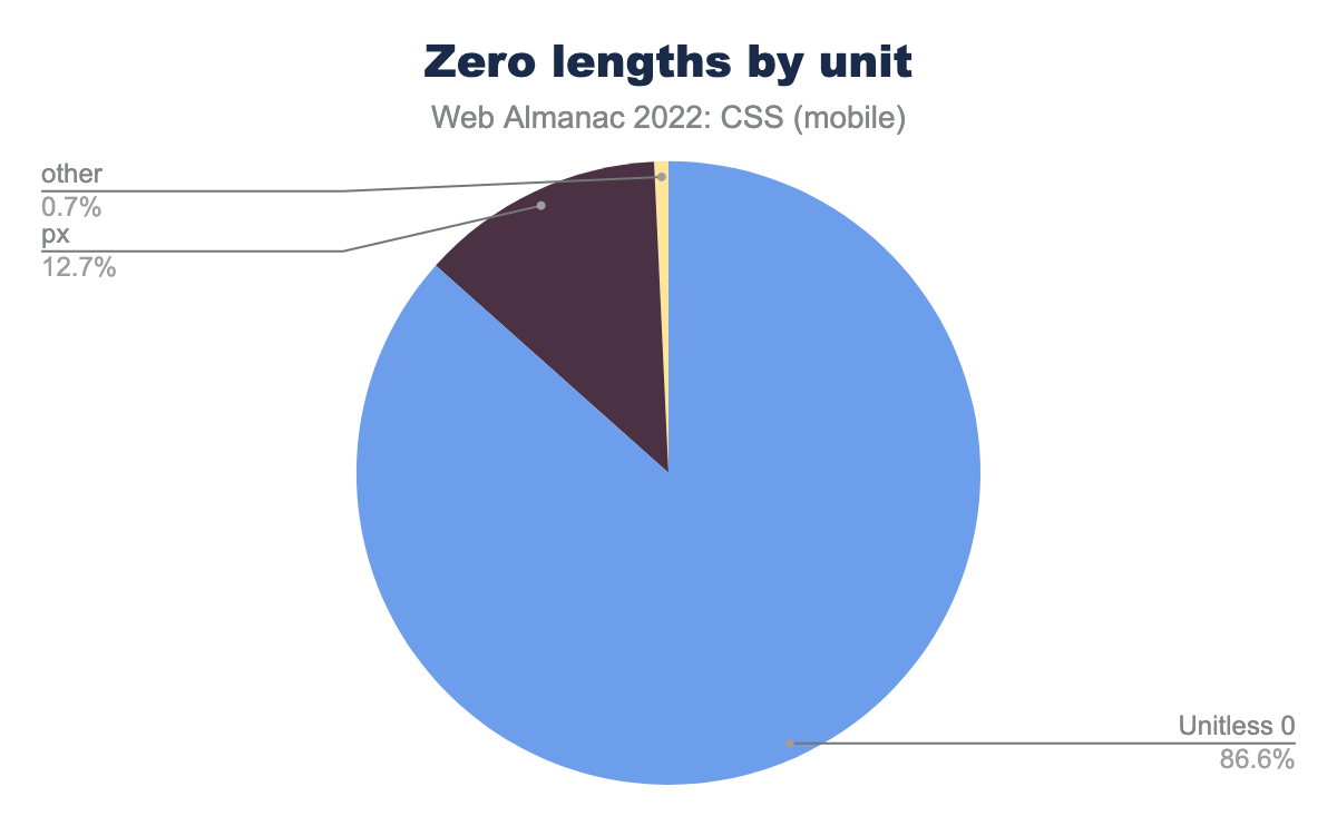
px on 12.7%, and other units on 0.7%.There are a few properties that allow bare <number> units (for example, line-height), but <length> values have a special case where a length of zero does not require a unit. When we looked at all zero-length values, almost 87% of them omitted the unit, this is a small decrease from last year. Nearly all of those zero lengths that included a unit used pixels (0px).
Calculations
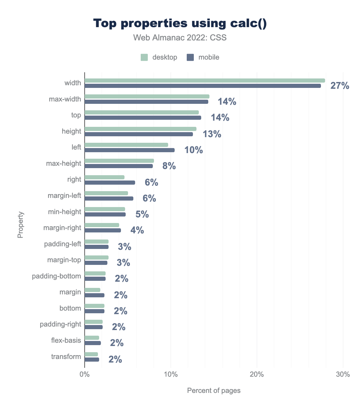
calc() properties used on the most pages. The most popular is width on 27% of pages, followed by max-width and top on 14%, height on 13%, left on 10%, max-height on 8%, right and margin-left on 6%, min-height on 5%, margin-right on 4%, padding-left and margin-top on 3%, then padding-bottom, margin, bottom, padding-right, flex-basis, and transform all on 2%.calc() functions.
As in previous years, the most popular use of calc() is in values for width. This use has dropped 12% points, however, max-width has increased in popularity by 9 points.
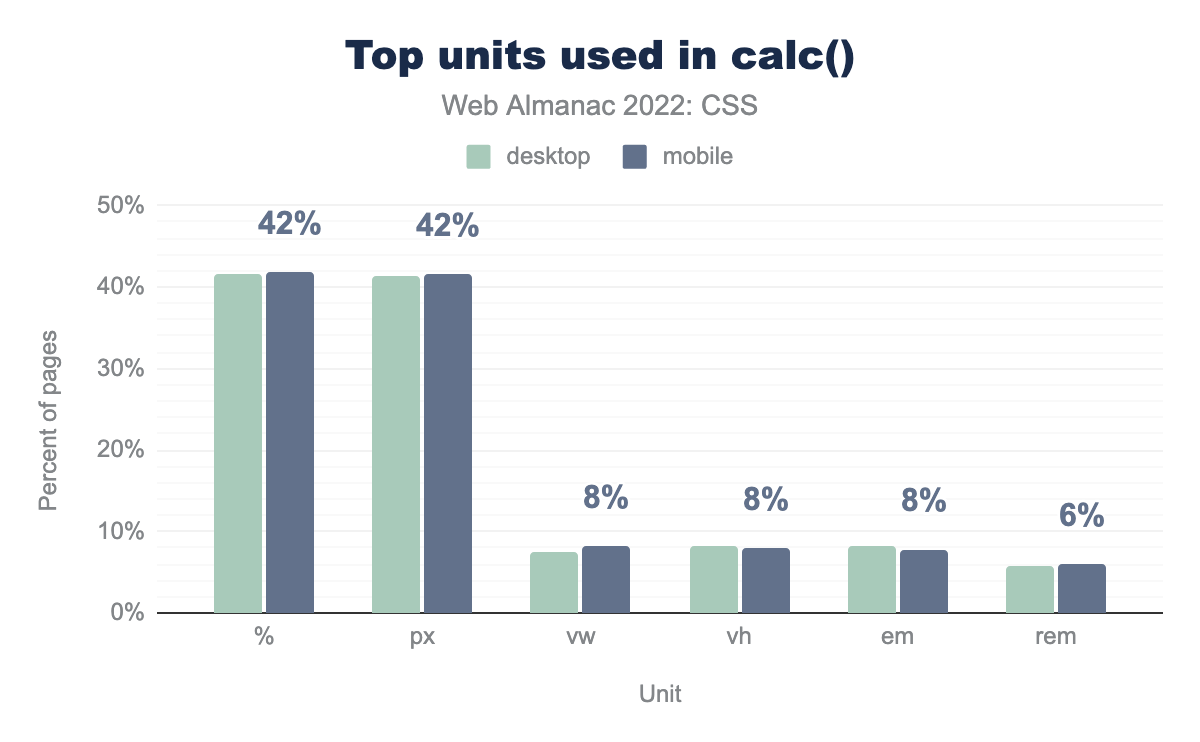
%) and pixels (px) are both used on 42% of pages, viewport width (vw), viewport height (vh), and em are all used on 8% of pages, and rem is used on 6%.calc() functions.
The percentage of sites using pixels in calculations has decreased 9 points, it is now level with % usage at 42%. There is a significant increase in usage for other values, the viewport units vw and vh both increased from 2% to 8% this year, em increased the same amount, and use of rem doubled from 3% to 6%.
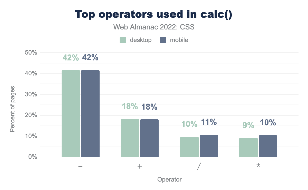
-) is used on 42% of pages, followed by addition (+) on 18%, division (/) on 11%, and multiplication (*) on 10%.calc() functions.
Subtraction remains the clear favorite in terms of calculation operators, but all four top values saw a drop since 2021, other than addition, which remained the same.
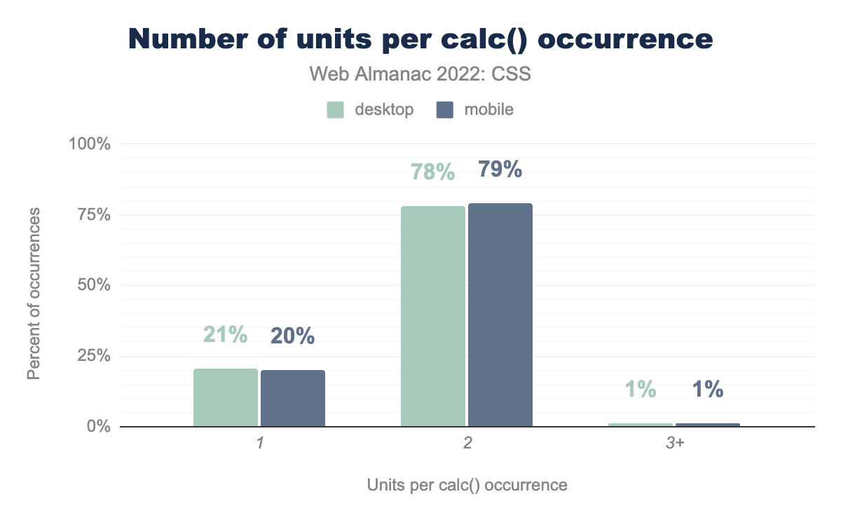
calc() occurrence. 79% of calc() occurrences use two units, followed by 20% of occurrences that use one unit. Only 1% of occurrences use three or more units.calc() values.
As last year, calc() values tend to be fairly simple. The majority using two values, such as the common use case of subtracting a fixed length such as pixels from a percentage. There was a small rise in one unit values, and a small drop in two units.
Global keywords
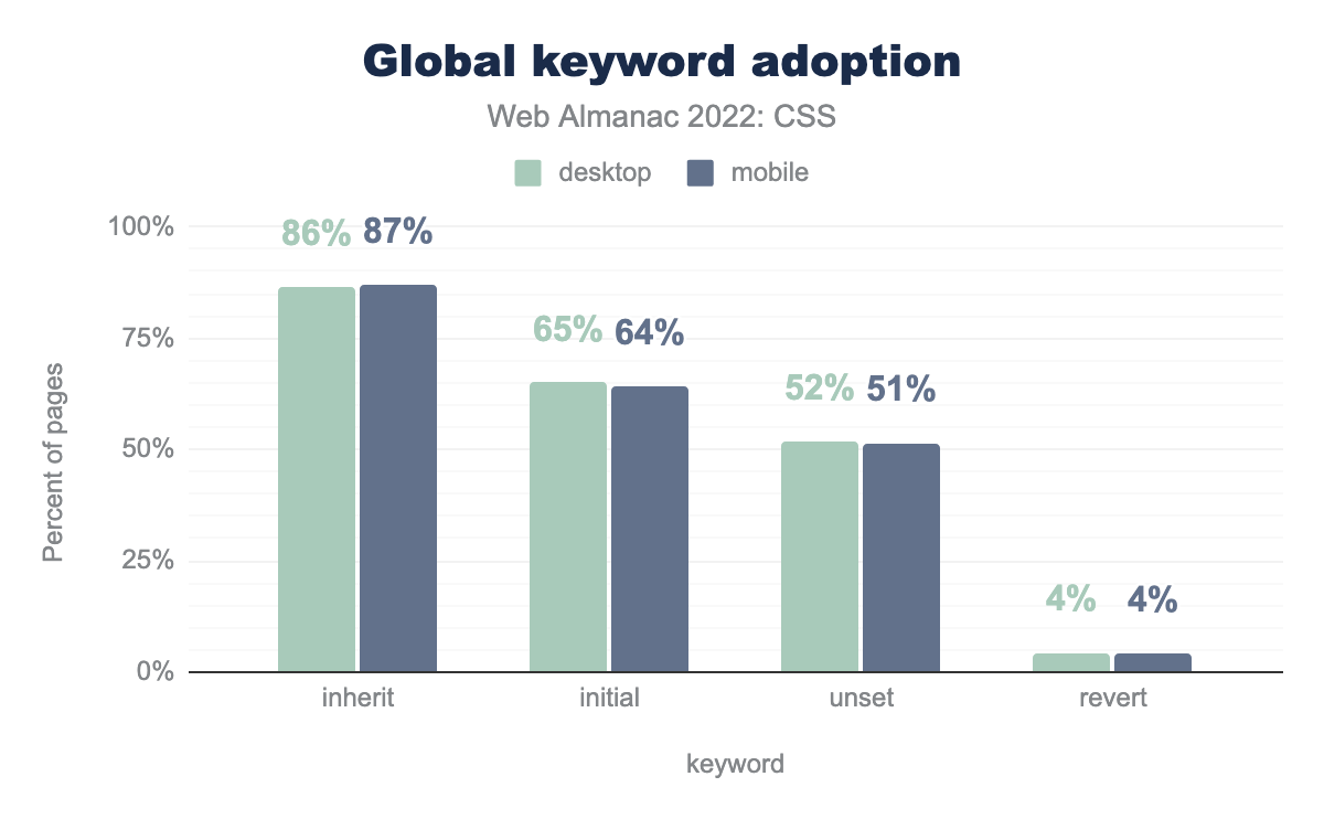
inherit is used on 87% of pages, followed by initial on 64%, unset on 51%, and revert on 4%.Last year the use of global keywords had risen significantly, in 2022 inherit is found in the same percentage of pages, however the other three values have increased in use. The newer value of revert has increased from 1% to 4%.
Custom Properties
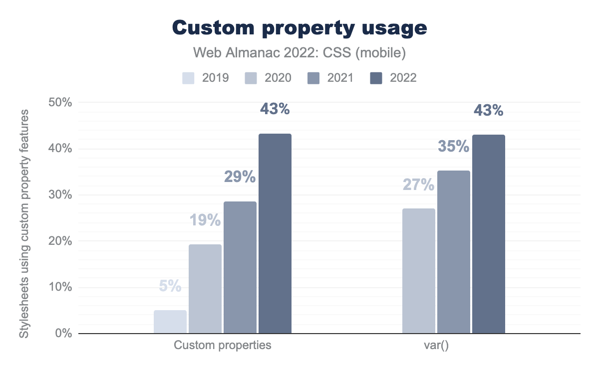
var() function was used on 27% of pages in 2020, 35% in 2021, and now 43% in 2022.Custom properties (sometimes known as CSS variables) have seen a huge surge in use, the growth between 2021 and 2022 is no exception. 43% of pages, for both desktop and mobile are using custom properties and have at least one var() function.
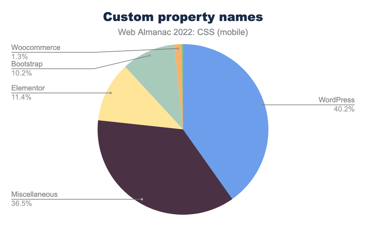
As seen last year, WordPress is the driver for the most common custom property names, these are easily identifiable by the –wp–* prefix. Following these, we once again found a lot of color names –white, –blue, and so on, used to assign a particular shade of that color.
Types
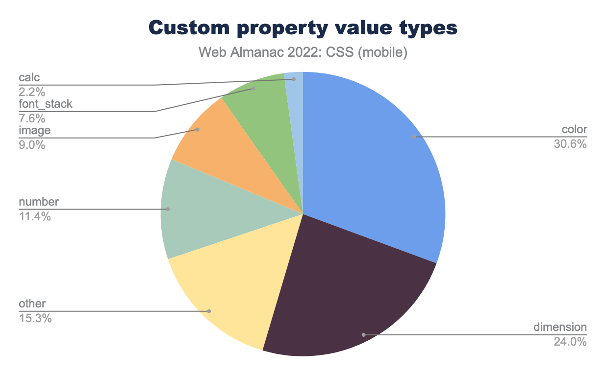
The value of a custom property includes a type. For example, --red: #EF2143 is assigning a color value to --red, whereas --multiplier: 2.5 is assigning a number value. The types have changed a little since last year. We know that setting a color is the most common use of custom properties, and the amount of pages on which color types are found is increasing. However, in terms of the share of usage, this has dropped from 40% to 30%. Entering this distribution is calc(), and images as a value type.
Properties
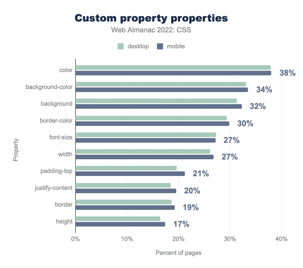
color property is set with a custom property on 38% of pages, followed by background-color on 34%, background on 32%, border-color on 30%, font-size and width on 27%, padding-top on 21%, justify-content on 20%, border on 19%, and height on 17%.While the number of pages including these properties has increased, the properties that have custom properties as a value have remained in roughly the same order as last year. Custom properties are most likely to be used for color, unsurprisingly as creating color schemes is an obvious use of this functionality. Using the var() function to set font-size has moved from 10th place to 5th in the list however, and setting the alignment value of justify-content has moved into the top ten. In 2021 5% of mobile, and 4% of desktop pages were using custom properties to set this alignment value, this has jumped to 20%. From the data it looks as if some of this increase is due to WordPress usage, 5% of pages use the –navigation-layout-justify custom property, for example.
Functions
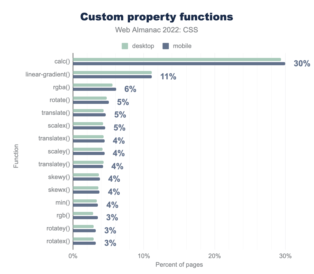
calc, used on 30% of pages, followed by linear-gradient on 11%, rgba on 6%, rotate, translate, and scaleX all on 5% of pages, translateX, scaleY, translateY, skewY, skewX, and min on 4% of pages, rgb, rotateY, and rotateX all on 3% of pages.We saw that calc() has started to be notable as a value type for custom properties, and it is by far the most commonly seen function used in this way. It is followed by linear-gradient() and the rgba() function used to set RGB color values with an alpha channel. After this are the various functions used for transitions and animations, showing a growing use of custom properties in this area.
Complexity
It’s possible to include custom properties in the values of other custom properties. Consider this example from the 2020 Web Almanac:
:root {
  --base-hue: 335; /* depth = 0 */
  --base-color: hsl(var(--base-hue) 90% 50%); /* depth = 1 */
  --background: linear-gradient(var(--base-color), black); /* depth = 2 */
}
As the comments in the previous example show, the more that these sub-references are chained together, the greater the depth of the custom property.
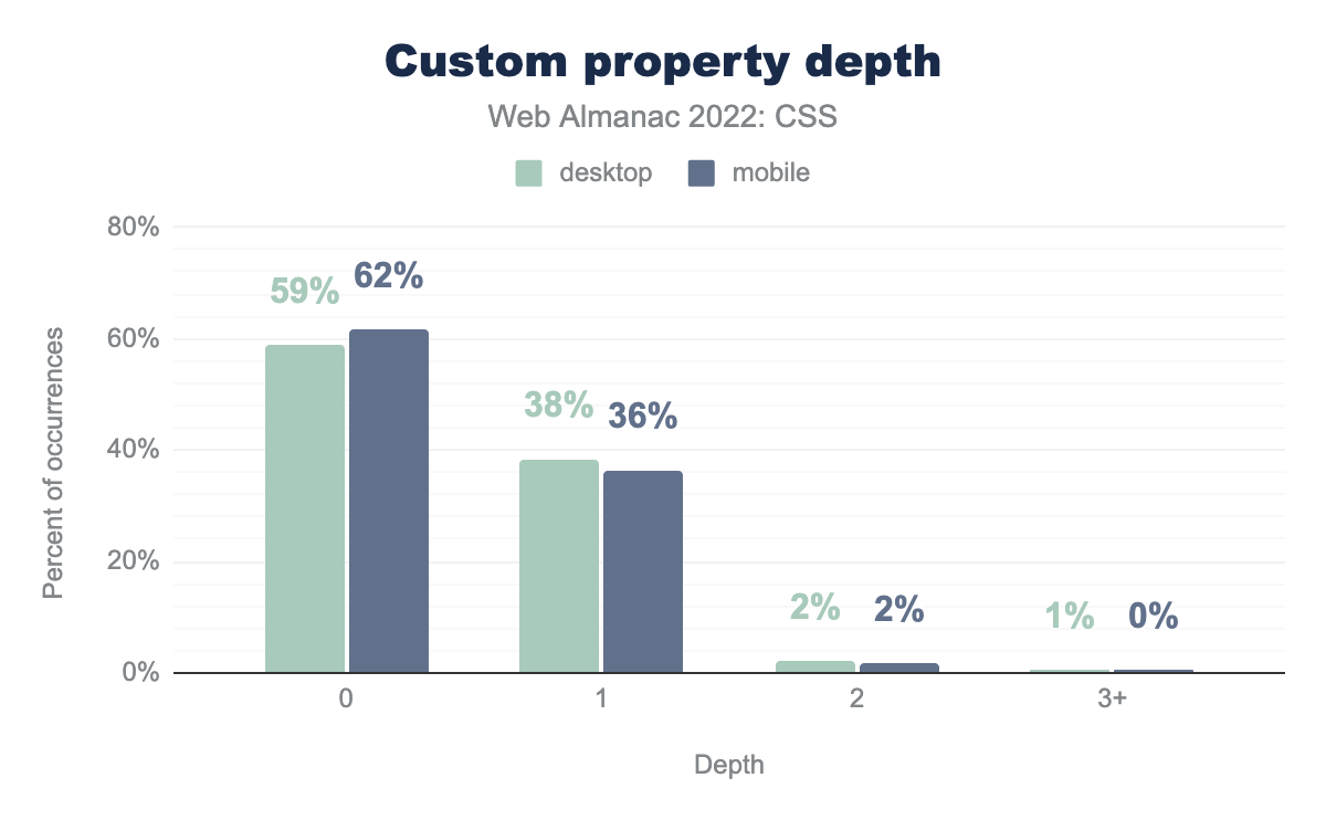
As seen in 2021, the vast majority of custom properties had a depth of zero, meaning that they did not include the values of other custom properties in their value. There has been a small increase in the number of properties with a depth of one, and a small decrease in the number with a depth of two. However, it does not seem from the data that our use of custom properties has become much more complex in the past year.
Colors
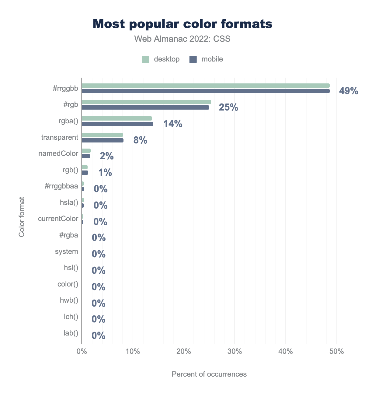
#RRGGBB syntax is used on 49% of pages, three-digit #RGB on 25% of pages, the rgba function on 14% of pages, the transparent keyword on 8% of pages, a named color on 2%, the rgb function on 1%, and the rest of the formats were used on less than 1% of pages, including: eight-digit #RRGGBBAA, hsla function, currentColor keyword, four-digit #RGBA, system color keywords, hsl function, color function, hwb function, lch function, and finally the lab function, in descending order of popularity.The use of the time-honored six-digit #RRGGBB syntax remains unchanged since 2021, being used in half of color declarations. Despite the widespread availability of eight-digit #RRGGBBAA hex, the rgba() form is the most widely used way to add an alpha component, likely because it was implemented in browsers much earlier.
The usage of other values showed a similar story; the web community hasn’t yet started to take advantage of other color formats, even widely supported ones such as hsl().
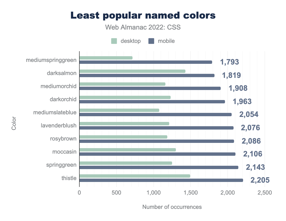
MediumSpringGreen is used on only 1,793 mobile pages. Adoption slowly increases from there, to DarkSalmon, MediumOrchid, DarkOrchid, MediumSlateBlue, LavenderBlush, RosyBrown, Moccasin, SpringGreen, and Thistle, which is used on 2,205 pages.8% of pages use the keyword transparent, making it the most popular named color. 2% of pages use other named colors, white being the most popular followed by black. At the other end of the scale mediumspringgreen languishes as the least popular color.
Alpha support and use
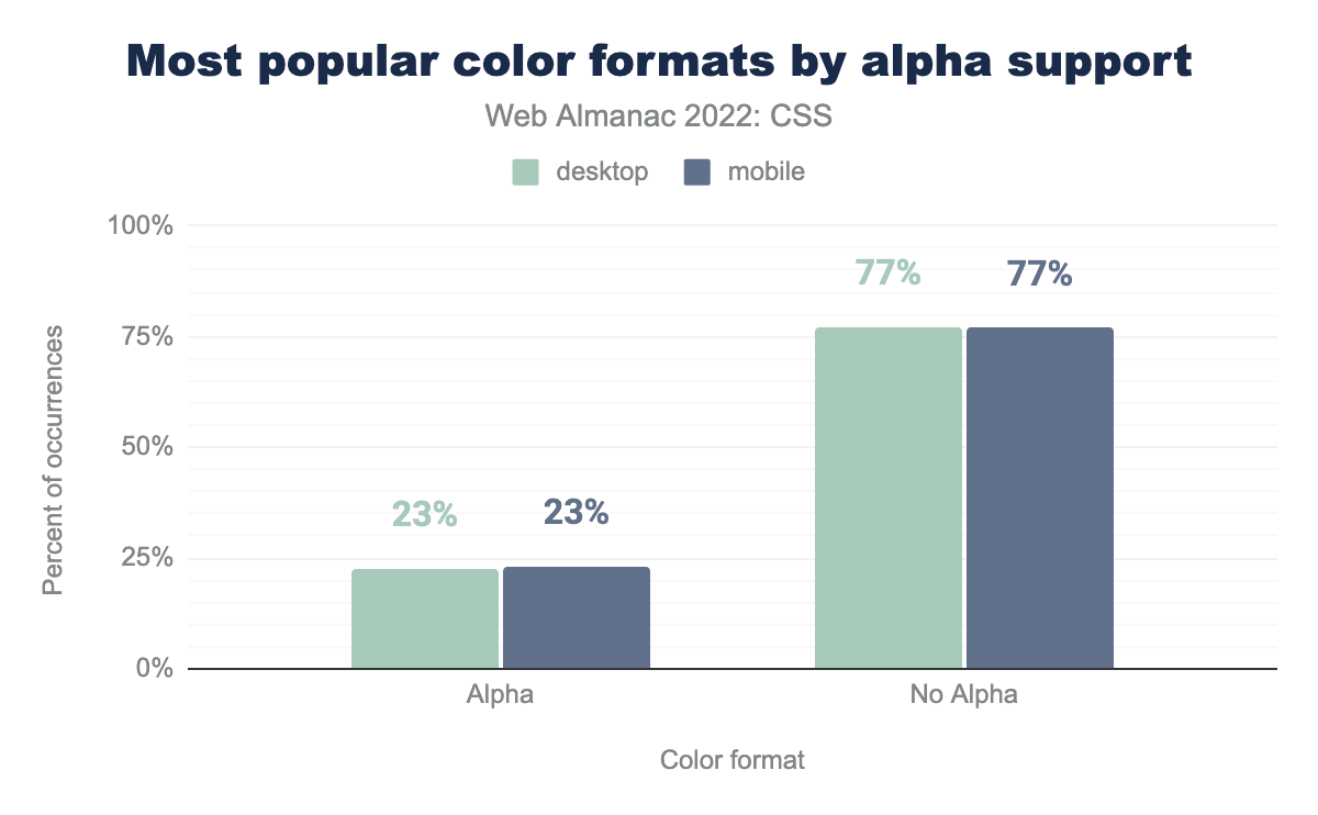
The rgba() function is the third most popular color format, used substantially more than the rgb() form, presumably in order to make use of alpha channel support. We looked at the occurrences of values with and without alpha support, to find that 77% of color formats used do not have support for an alpha channel.
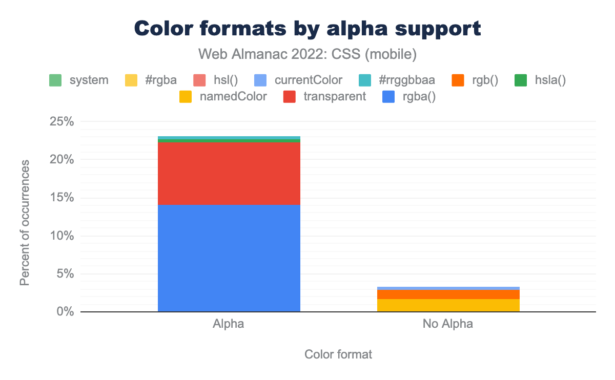
rgba function is used in 14% of occurrences, followed by the transparent keyword in 8%. Other formats register in less than 1% of occurrences.As we would expect from other data, rgba() is the most popular alpha-supporting format in use, followed by the transparent keyword. Other formats such as hsla() barely feature.
New color properties and values
There are interesting things happening in the world of color. In addition to new color spaces, we have a number of color-related properties and values. We wondered if any of these were making an impact on the data.
The accent-color property lets you add your brand color as an accent color to notoriously hard-to-style form elements such as checkboxes, radio buttons, and range sliders. Perhaps due to the fact it has only been available in all engines since March this year, it still shows less than 0.3% usage.
Another property becoming available in all engines this year is color-scheme, a property that lets you specify in which color schemes (light or dark) a component can be rendered. This property is, somewhat surprisingly, so far only found in 0.2% of pages.
Gradients and Images
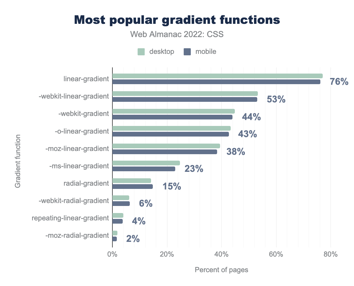
linear-gradient is used on 76% of pages, followed by -webkit-linear-gradient on 53%, -webkit-gradient on 44%, -o-linear-gradient on 43%, -moz-linear-gradient on 38%, -ms-linear-gradient on 23%, radial-gradient on 15%, -webkit-radial-gradient on 6%, repeating-linear-gradient on 4%, and finally -moz-radial-gradient on 2% of pages.Linear gradients continue as the leading choice, appearing on a slightly higher percentage of pages than in 2021, however gradient use stays pretty much the same for the last two years. There is still a very high frequency of prefix use when it comes to the linear-gradient property, despite this having been supported unprefixed in all engines for over nine years.
Image formats
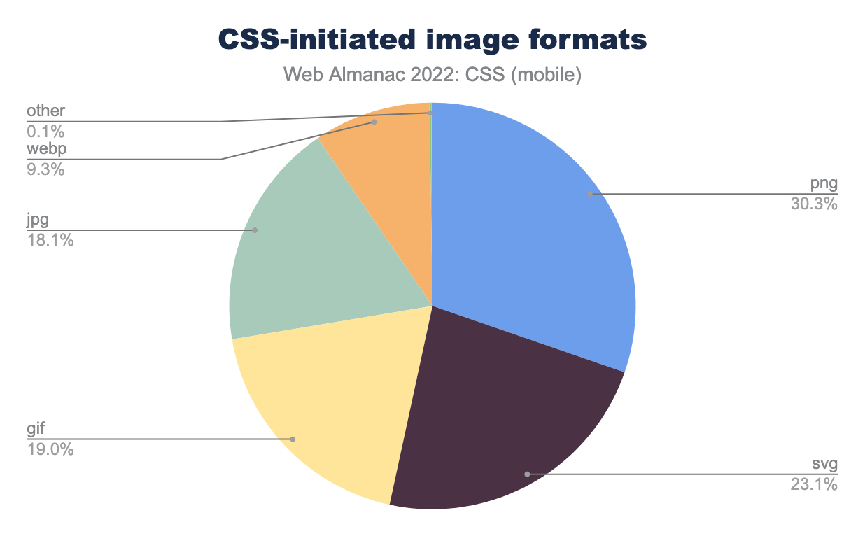
This chart breaks down the image formats of images loaded from CSS. It does not include images loaded from HTML, just those that appear in a style rule. There has been a significant swing away from PNG—down from 44% to 30%—with SVG and WebP each seeing an increase of 6 percentage points.
Number of images in CSS
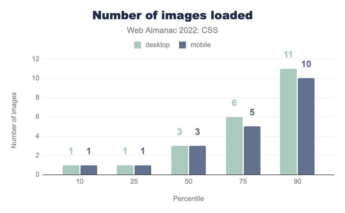
The number of images loaded from CSS remains the same as in 2021. CSS doesn’t cause many image loads: the lower two percentiles came in at one image each, and even the 90th percentile hovered around 10 images, across all image types.
Weight of images in CSS
While CSS doesn’t cause many image loads, the weight of those images is important. The data showed that image weight has increased from 2021, despite the fact that the number of images has stayed the same.
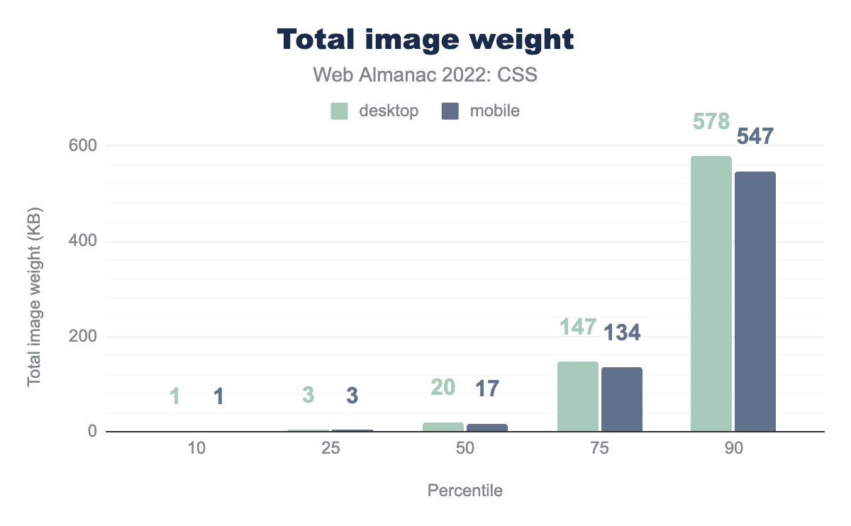
The median page, on mobile, has increased image weight by 1KB to 17KB. At the upper end of the chart however, at the 90th percentile we see an increase of 67KB on mobile and 42KB on desktop. As in 2021, the weight is consistently lower on mobile, an indication that developers are trying to serve smaller images to mobile contexts.
Pixel size of images in CSS
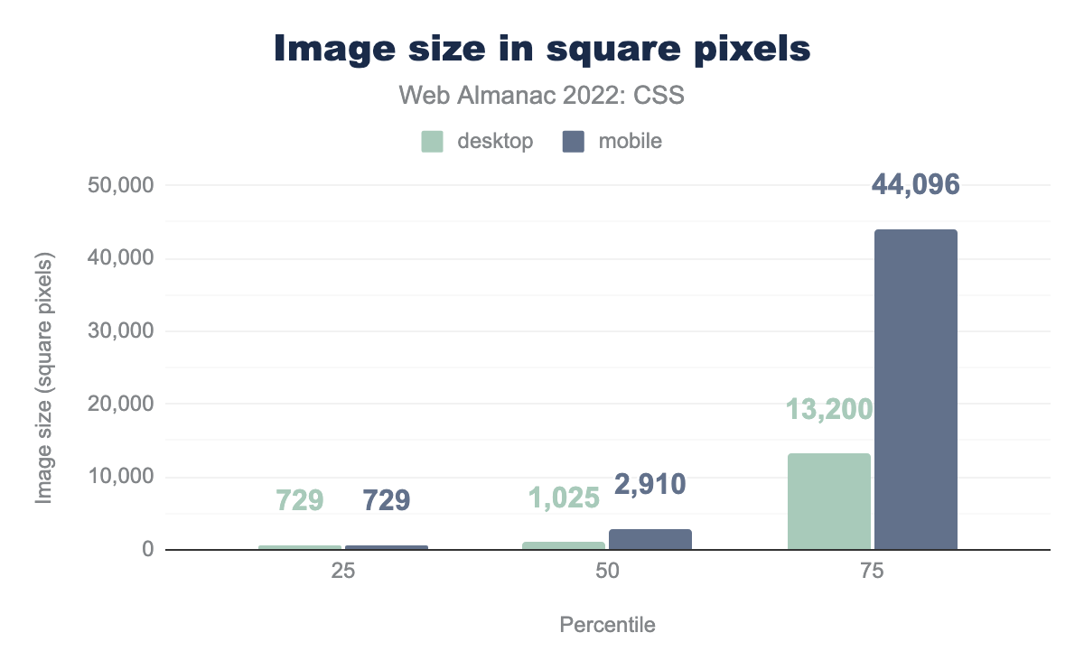
This is an interesting chart which shows that at the lower end of the chart people are serving images of around the same size to desktop and mobile, at the 50th and 75th percentile pages are serving far larger images to their mobile users than they do to desktop. What the data shows is that people are serving much wider images to their mobile users, perhaps to try to account for tablets in landscape mode.
Layout
We have many options to choose from when doing layout on the web, and most sites will be using a variety of these methods. A simple search of the data, looking for property and value combinations to detect layout methods in use, gives us the following table.
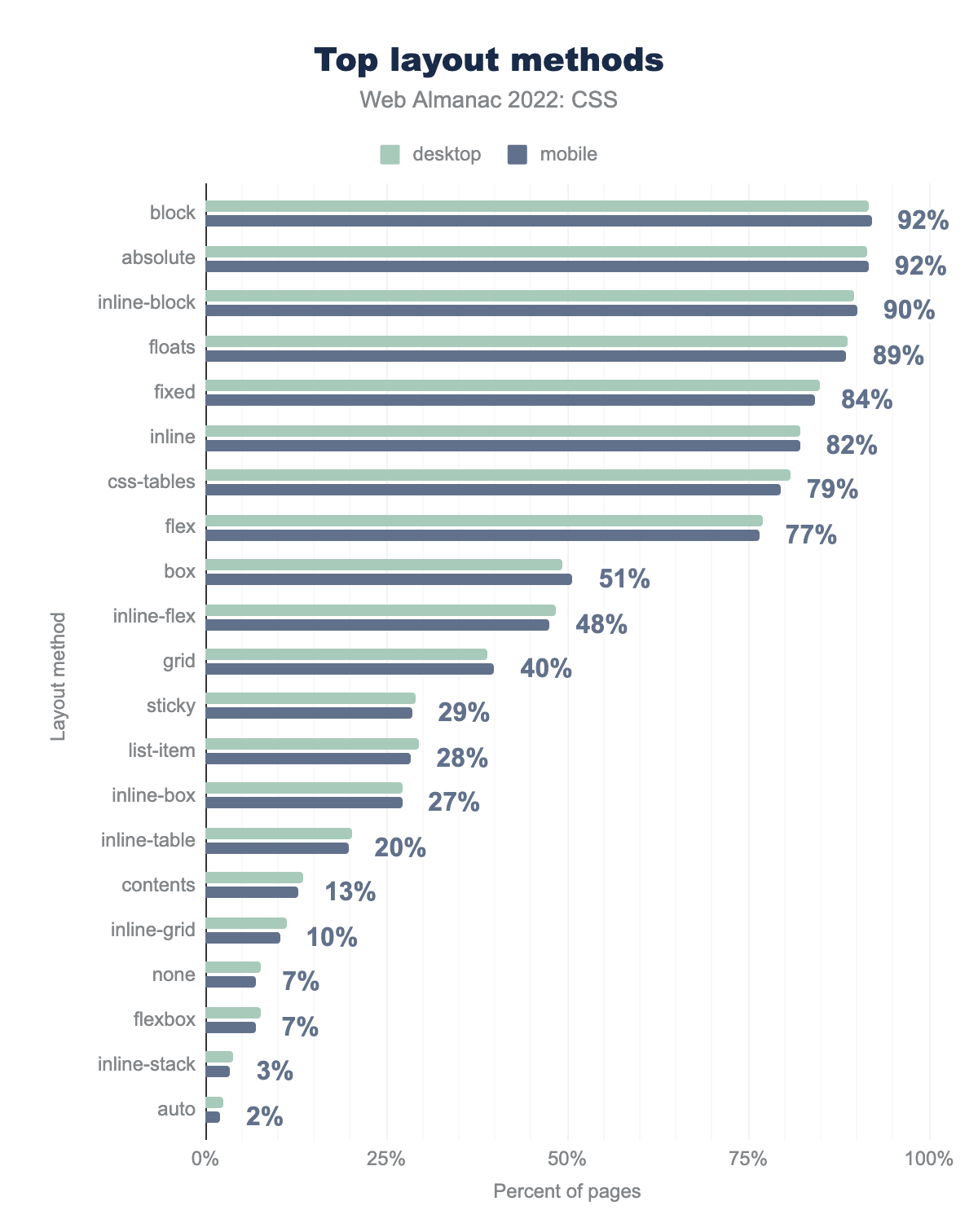
block and absolute layouts are used on 92% of pages, followed by inline-block on 90%, floats on 89%, fixed on 84%, inline on 82%, CSS tables on 79%, flex on 77%, and box on 51% of pages.This chart doesn’t tell us the main layout method used on a page. It indicates that a property or value appears in the CSS for those pages. For example, 51% of pages are using the old 2009 version of flexbox, with display: box. It’s likely this has been added for backwards compatibility, perhaps via a tool such as Autoprefixer.
Flexbox and grid adoption
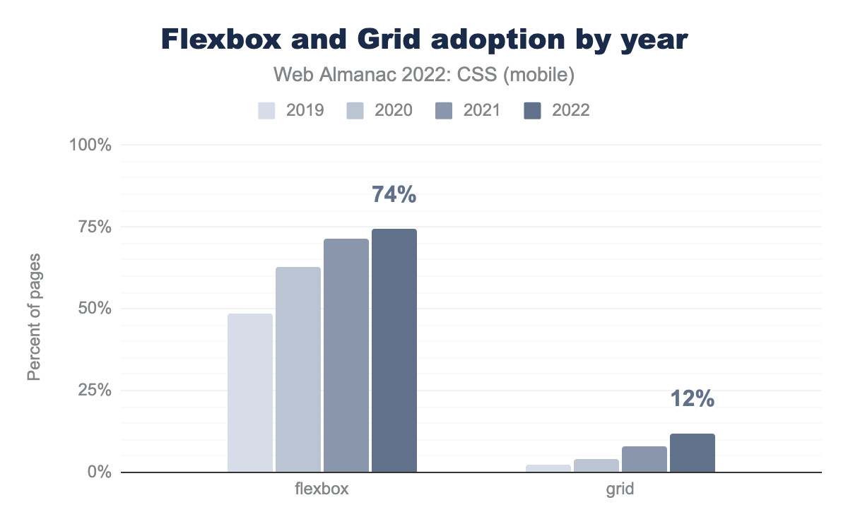
Flexbox and grid usage continue to grow. In 2021, flexbox adoption was 71%—it’s now at 74%. Grid has jumped from 8% to 12%. Note that, in contrast to the previous section, what is measured here is the percentage of pages that are actually using flexbox or grid for layout, as opposed to the pages that simply have some sort of flexbox or grid property in their stylesheet.
Grid adoption is reasonably slow. We feel this may be due to the prevalence of frameworks being used for layout, many of which have based their layouts on flexbox.
We also took a look at a couple of values of flex and grid properties that are newer to us, to see how adoption of these new features was developing.
The value of content for the flex-basis property is an explicit instruction for the browser to look at the intrinsic content size of the item, rather than any width set on it. It’s a newer value, at the time of writing not available in the release version of Safari. Currently, only 0.5% of mobile and 0.6% of desktop sites use this value.
The subgrid value for grid-template-rows and grid-template-columns is, at the time the queries were run, only supported in Firefox. Perhaps unsurprisingly, it appears in only 211 mobile and 212 desktop pages in the entire dataset. As the value is part of the Interop 2022 project, we will be interested to see how support grows once this becomes interoperable.
Box sizing
box-sizing: border-box.
The web has overwhelmingly voted to reject the original W3C box model in favor of box-sizing: border-box. The number of pages using this property and value combination has risen slightly again to over 90% of pages.
box-sizing: border-box on the * selector.
Almost half of all pages analyzed apply border-box sizing to every element on the page via the universal selector (*).
Around 22% of pages use border-box on checkboxes and radio buttons. We see a lot of .wp- classes again, showing that WordPress is responsible for the use on 20% of pages analyzed.
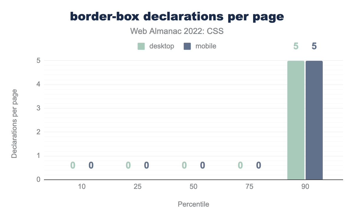
box-sizing: border-box declarations per page. The values in order are: 1, 7, 22, 52, and 101 declarations per page.border-box declarations per page.
The median mobile page declares border-box 22 times. At the 90th percentile, it’s declared an overwhelming 101 times. Note that previous years’ queries had a bug affecting this metric. Correcting for that, the results in 2021 are comparable.
Multicolumn
Use of multi-column layout has increased once again, it’s now found on 23% of pages, a rise of 3 points since 2021.
The aspect-ratio property
aspect-ratio property.
The new aspect-ratio property is used on 2% of pages. This became interoperable towards the end of 2021, so it will be interesting to see usage of this property grow over time.
Transitions and animations
The animation property appears on 77% of mobile pages (the same as last year) and a slight increase on desktop to 76.8%. The transition property is even more popular, it’s found on 85% of mobile and 85.6% of desktop pages. The desktop frequency has dropped slightly by around 4 percentage points since 2021.
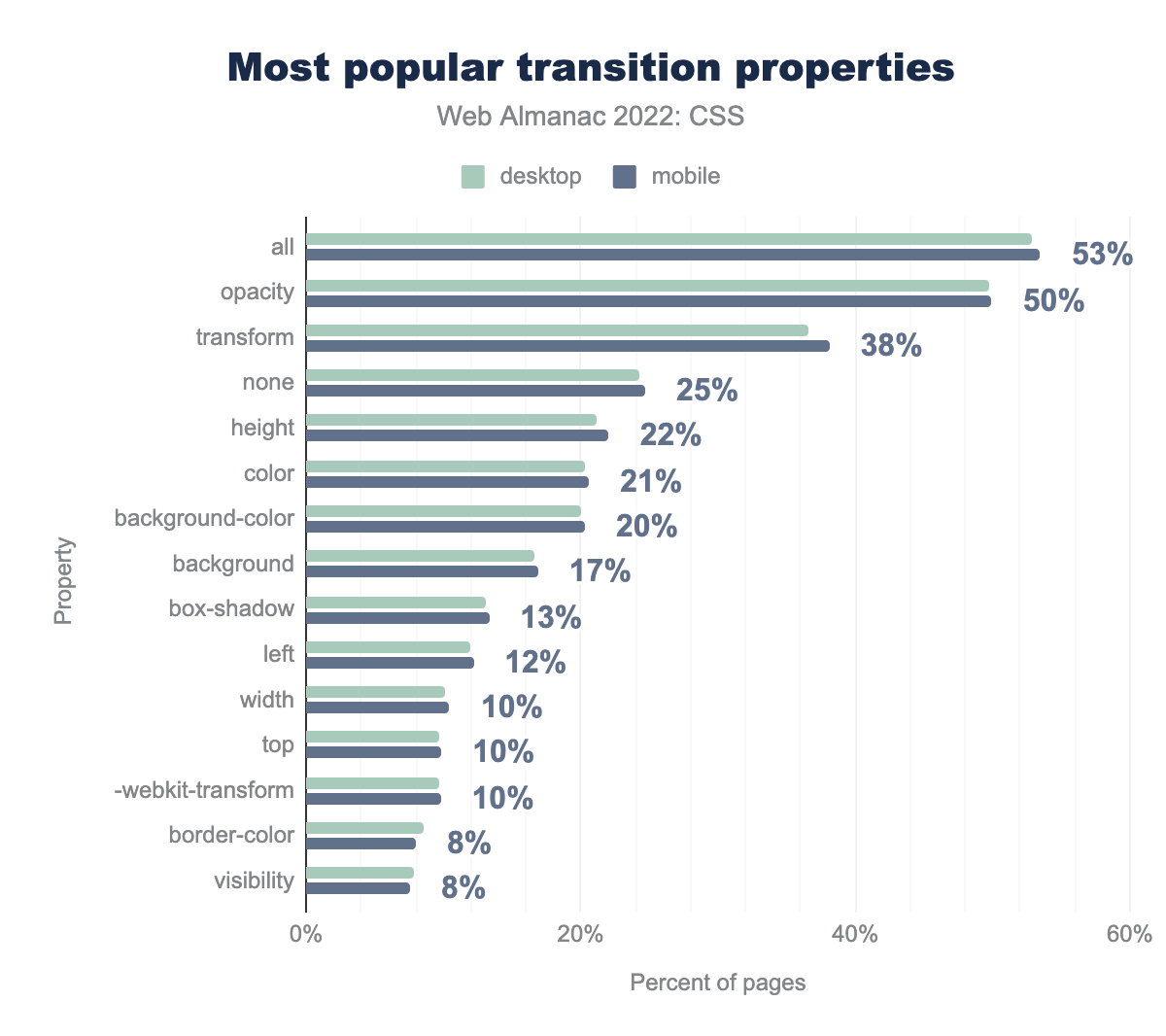
transition properties used on the most pages. The most popular property all is used on 53% of pages, followed by opacity on 50%, transform 38%, none 25%, height 22%, color 21%, background-color 20%, background 17%, box-shadow 13%, left 12%, width, top, and -webkit-transform 10%, border-color and visibility 8%.transition properties by percent of pages.
As seen last year, the most common usage is to apply transitions to all animatable properties with the all keyword. This usage has grown to 53%—up 7 percentage points—followed by opacity at 50% of pages.
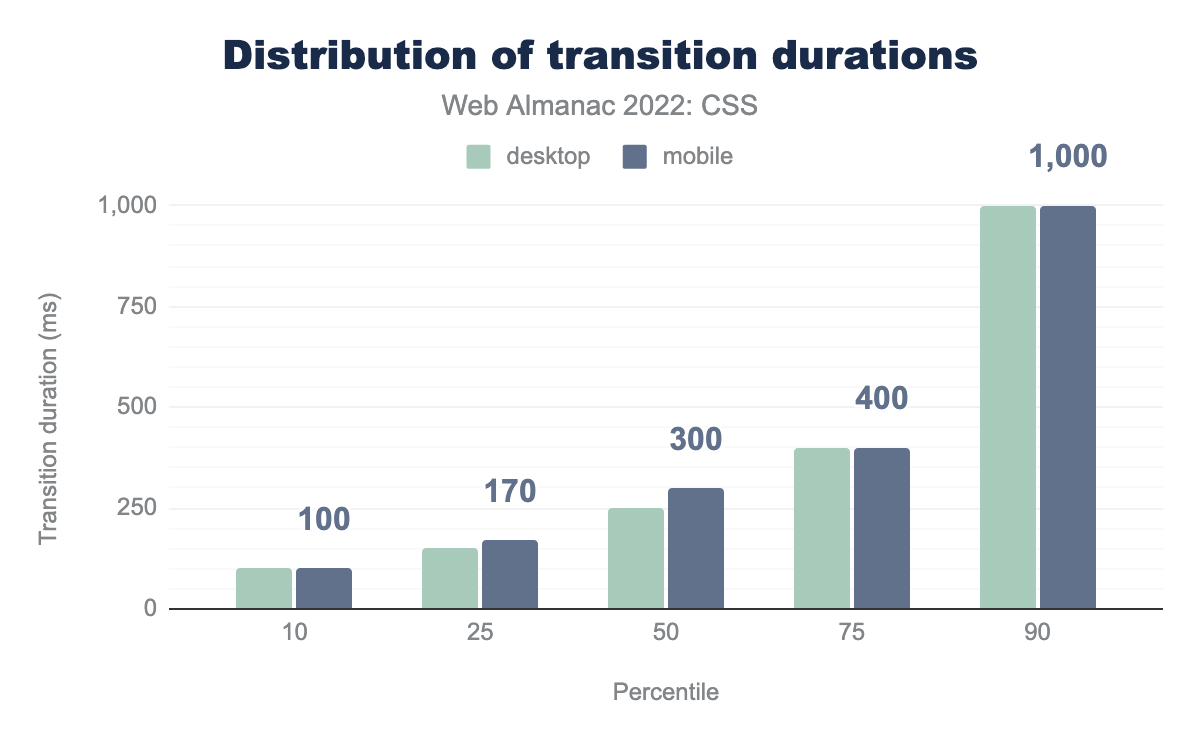
Looking at the duration of transitions, we see a change from last year. In 2021, at the 90th percentile the median transition duration was half a second, this has now jumped to 1 second. We see increases across all top four percentiles.
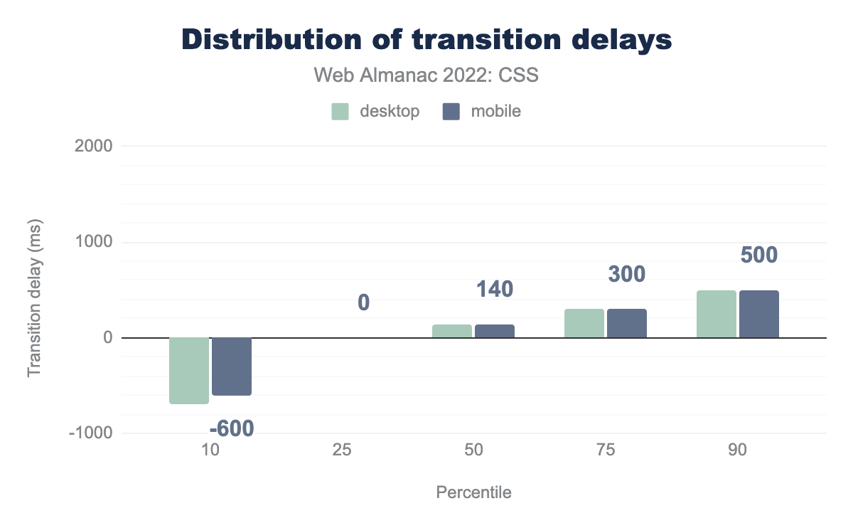
The distribution of transition delays has also changed. The 90th percentile delay has dropped from 1.7 seconds to half a second. Though the 10th percentile median delay is now over half a negative second. This is seen when a transition starts partway through the resulting animation.
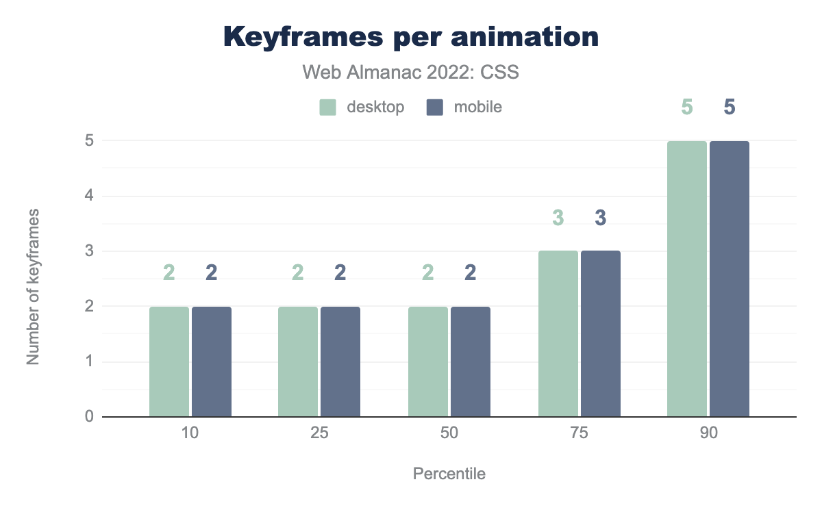
We also looked at the average number of keyframes used per animation, and found one site that used an astonishing 6,995 keyframes. This was unusual however, and even at the 90th percentile, the number of keyframes per animation is five on both desktop and mobile.
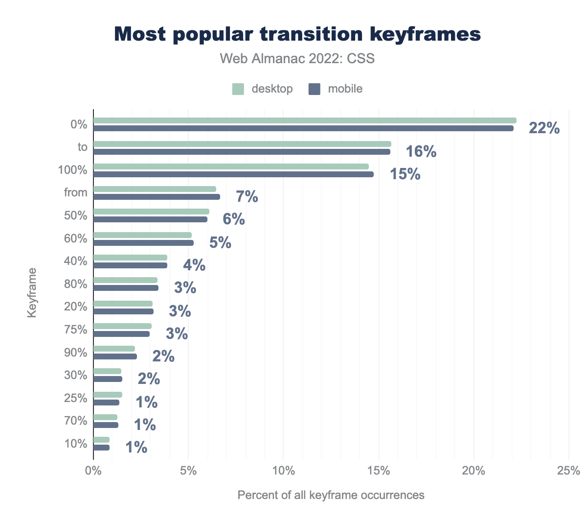
As you might expect the most popular stops are at 0% to and from 100%, followed by 50%. Developers generally set these stops at 10% intervals, only 1% of pages use 33%, for example.
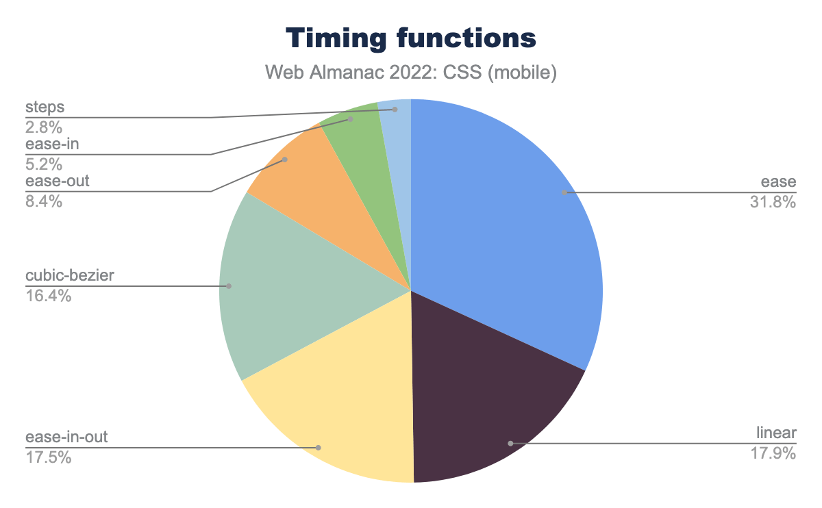
ease function is used on 31.8% of transitions, followed by linear on 17.9%, ease-in-out on 17.5%, cubic-bezier on 16.4%, ease-out on 8.4%, ease-in on 5.2%, and steps on 2.8%.There has been little change in the distribution of timing functions used during transitions when compared to 2021. As then, the clear leader is ease.
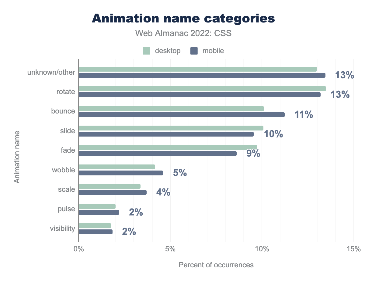
rotate at 13%, bounce at 11%, slide at 10%, fade at 9%, wobble at 5%, scale at 4%, pulse at 2%, and visibility at 2%.To understand what developers are using animations for, we took a look at the names used for the animation classes. For example, anything with spin in the class name is deemed to be rotate. Rotate animations were the most popular, as in 2021. However the percentage has dropped from 18% to 13%, with bounce animations moving from 5th place to 3rd place in the list.
As last year, the high showing for unknown/other is due to a prevalence of the class name a, which we can’t map to a specific animation type.
Visual Effects
We looked at some visual effects being used in CSS. For example, 18% of desktop pages define styles on the background-blend-mode or mix-blend-mode properties.

multiply value is used on 42% of pages that set the blend-mode property, followed by overlay and screen on 33% of pages, darken on 32%, lighten on 31%, soft-light on 29%, color on 28%, color-burn and color-dodge on 28%, and finally difference on 21%.The most frequently seen value for blend modes was multiply, seen on 42% of pages. However there is a fair distribution of other values too.
Around 18% of pages were using a custom property var(--overlay-mix-blend-mode), a specific name that must come from a library or tool of some sort.
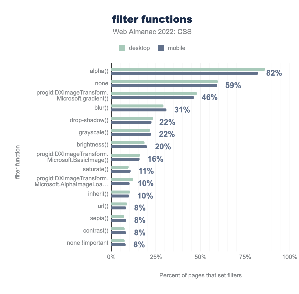
alpha function is used 82% of the time, followed by no filter (none) 59%, progid:DXImageTransform.Microsoft.gradient 46%, blur 31%, drop-shadow and grayscale 22%, brightness 20%, progid:DXImageTransform.Microsoft.BasicImage 16%, saturate 11%, inherit 10%, url, sepia, contrast, and none !important all 8%.
Of the percentage of pages that have set filters to apply graphical effects, 82% are using the alpha() value, which is non-standard and used for Internet Explorer 8 and below. We also see a high usage of the Microsoft.gradient() filter.
Of the standard values, 31% of pages use blur(), making it the most popular value after none.
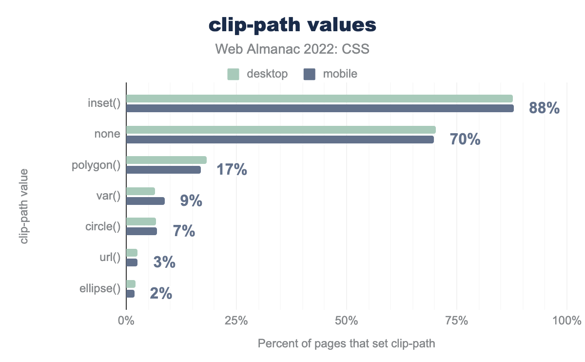
clip-path values used on the most pages that set clip-path. The most popular value is inset, which is used 88% of the time, followed by none 70%, polygon 17%, var 9%, circle 7%, url 3%, and ellipse 2%.clip-path values in pages that set clip-path().
In pages that use clip-path to clip an element, the vast majority are using inset(), the value that simply insets the box of the element, 88% of pages using clip-path have used this function.
After that, and the value none, most developers have chosen to use polygon(), which is the value that gives the most flexibility to define your own path.
Responsive design
While many developers are eagerly anticipating container queries, and new layout methods such as flexbox and grid can often enable a design to work well on multiple screen sizes, media queries are used in the majority of pages for responsive design.
When developers write media queries, they most often test the width of the viewport. max-width and min-width were the most popular queries by far, the same as in 2020 and 2021. There was no ranking change in the third and fourth place results either.
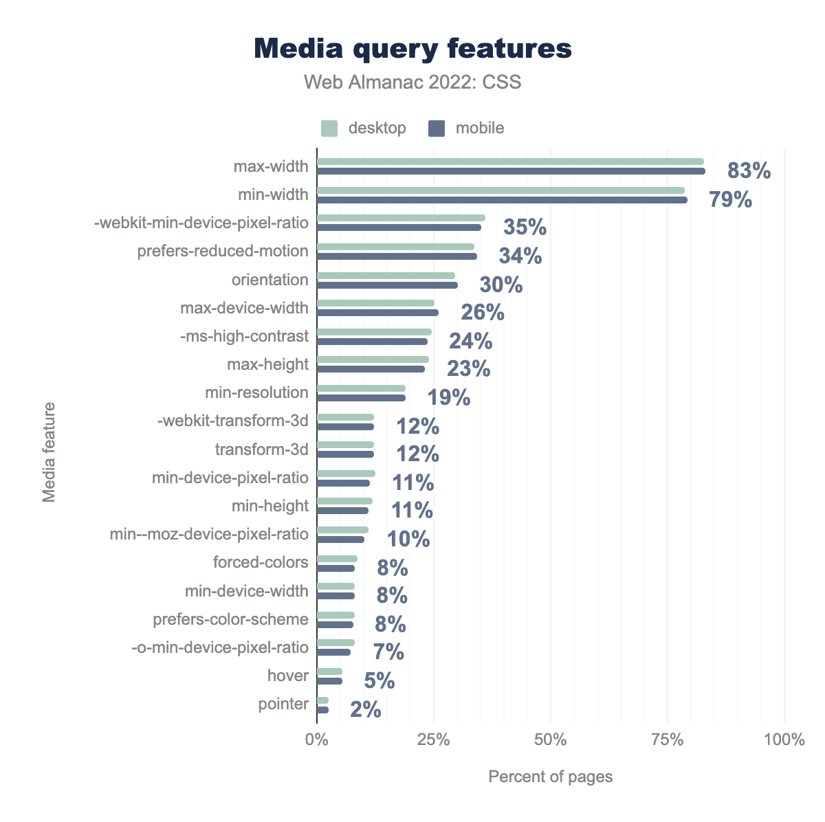
max-width on 83% of pages, followed by min-width 79%, -webkit-min-device-pixel-ratio 35%, prefers-reduced-motion 34%, orientation 30%, max-device-width 26%, -ms-high-contrast 24%, max-height 23%, min-resolution 19%, -webkit-transform-3d and transform-3d 12%, min-device-pixel-ratio and min-height 11%, min--moz-device-pixel-ratio 10%, forced-colors, min-device-width, and prefers-color-scheme 8%, -o-min-device-pixel-ratio 7%, hover 5%, and pointer 2%.The prefers-reduced-motion media query, however, which was noted in 2021 as rising in the rankings, has now edged out orientation to take the fourth spot. This is due to a 2% rise for prefers-reduced-motion but also a drop of 4% for orientation.
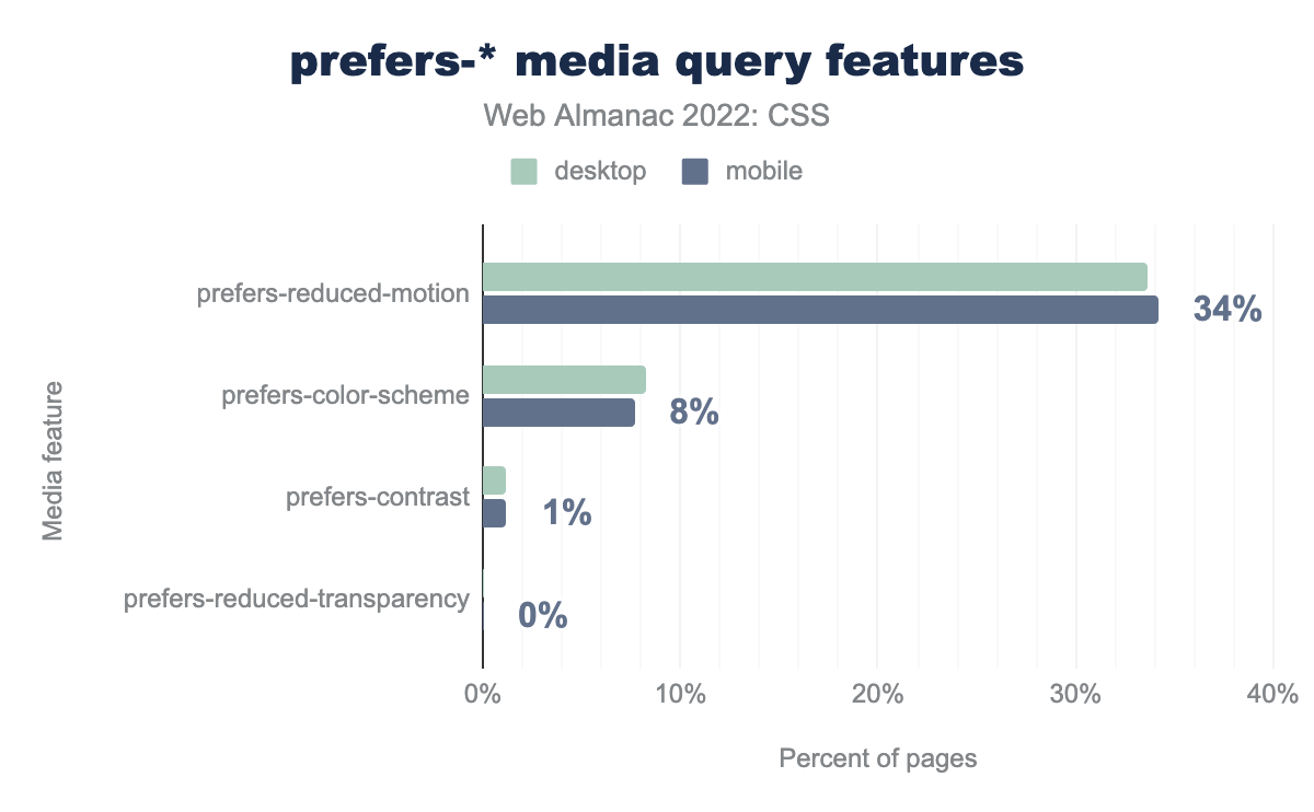
prefers. The most popular value is prefers-reduced-motion on 34% of pages, then prefers-color-scheme 8%, prefers-contrast 1%, and prefers-reduced-transparency less than 1%.If we just look at the prefers-* user preference features, we can see that prefers-reduced-motion is by far the most popular, due to good browser support plus the prevalence of animations and transitions on the web. The prefers-color-scheme feature, checking to see if the user has set a preference for a light or dark scheme, has increased in use slightly, as the use of dark mode on websites and applications becomes more popular.
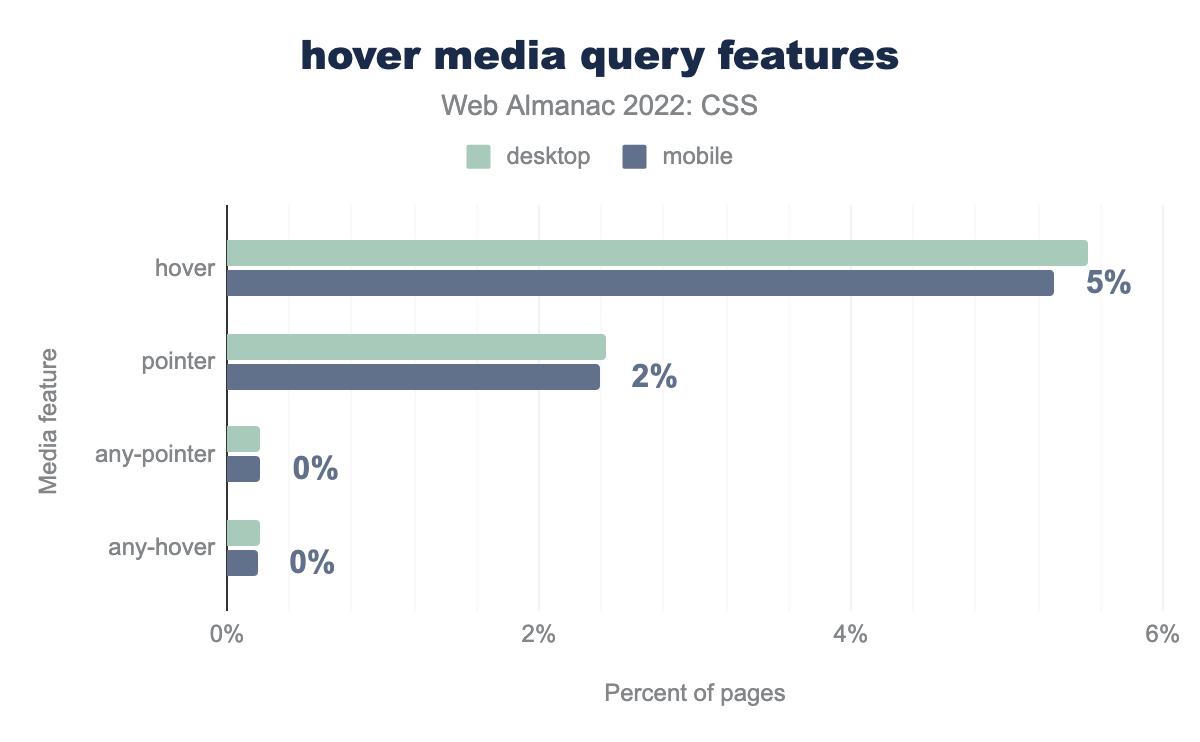
hover feature is used on 5% of pages, pointer 2%, and any-pointer and any-hover below 1% of pages.The hover and pointer media features help developers test the capabilities of the device, and the way the user might be interacting with it. They are a better way to discover if a user is using a touchscreen, for example, than screen size alone given the number of large tablets and touchscreen laptops in use.
Both hover and pointer now appear in the top ten features. The less useful any-pointer and any-hover see very little use. Using any-pointer allows you to determine if a user has access to a fine pointer such as a mouse or trackpad, even if pointer indicates they are currently using the touchscreen. Asking a user to switch is definitely not ideal, though a combination of these features could give you a good understanding of the environment a user is working in.
Common breakpoints
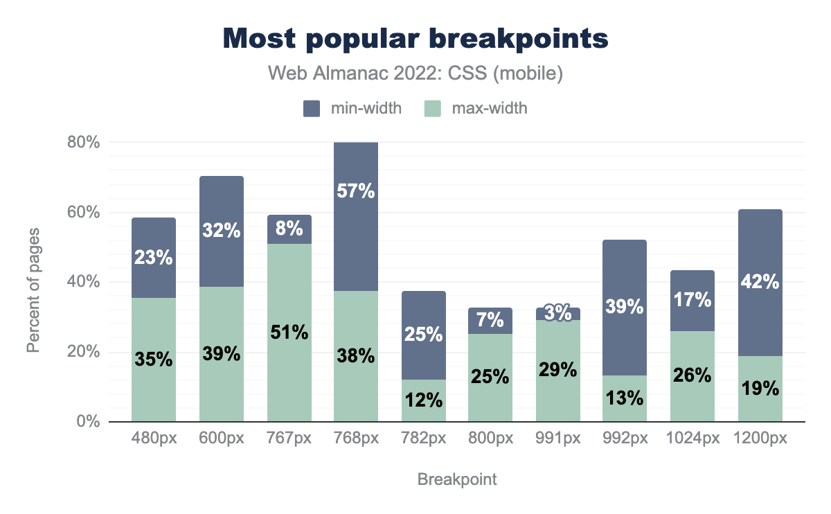
max-width and 23% for min-width . 39% of pages use 600px for max-width and 32% for min-width . 51% of pages use 767px for max-width and 8% for min-width . 38% of pages use 768px for max-width and 57% for min-width . 12% of pages use 782px for max-width and 25% for min-width . 25% of pages use 800px for max-width and 7% for min-width . 29% of pages use 991px for max-width and 3% for min-width . 13% of pages use 992px for max-width and 39% for min-width . 26% of pages use 1024px for max-width and 17% for min-width . 19% of pages use 1200px for max-width and 42% for min-width .As in the past two years, common breakpoints have changed little. The chart follows the same shape, and the most common breakpoint being a max-width of 767px and min-width of 768px. As noted in 2021, this corresponds with an iPad in portrait mode.
Once again, breakpoints are overwhelmingly set in pixel values, we haven’t converted other values to pixels for the chart. The first em value is again 48em, found at position 78.
Properties changed in queries
We looked at the properties that appear within media query blocks, to see which properties people were changing based on breakpoint.
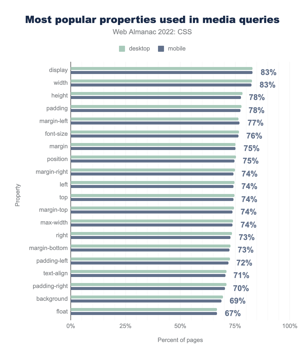
display and width properties are found in media queries on 83% of pages, followed by height and padding on 78%, margin-left 77%, font-size 76%, margin and position 75%, margin-right, left, top, margin-top, and max-width 74%, right and margin-bottom 73%, padding-left 72%, text-align 71%, padding-right 70%, background 69%, and float 67%.The display property is still top of the chart for properties changed within media queries, however there has been some reshuffling in the rankings. These are not as dramatic as they might seem. The color property has vanished from the chart, however this only represents a change from 74% to 67%. It is joined however by a reduction in usage of background-color for 65% to 63%, which makes us wonder if some framework, or perhaps WordPress has stopped using this in a stylesheet.
Another interesting point to note is that in 2020 font-size appeared in 73% of media blocks, and was fifth on the list. In 2021, it showed up in 60% of blocks, appearing at 12th. This year it has gained ground, back to 76% and sixth place.
Feature Queries
Features queries, used for testing for support of a CSS feature, were found on 40% of mobile pages and 38% of desktop pages. This was down from a figure of 48% in 2021. This may indicate that support for common features tested has become great enough for people not to worry about testing for the feature before use.
The number of feature query blocks per page is 4 at the 75th percentile, and at the 90th percentile 7 for desktop and 8 for mobile. We did find one site however with 1,722 feature query blocks.
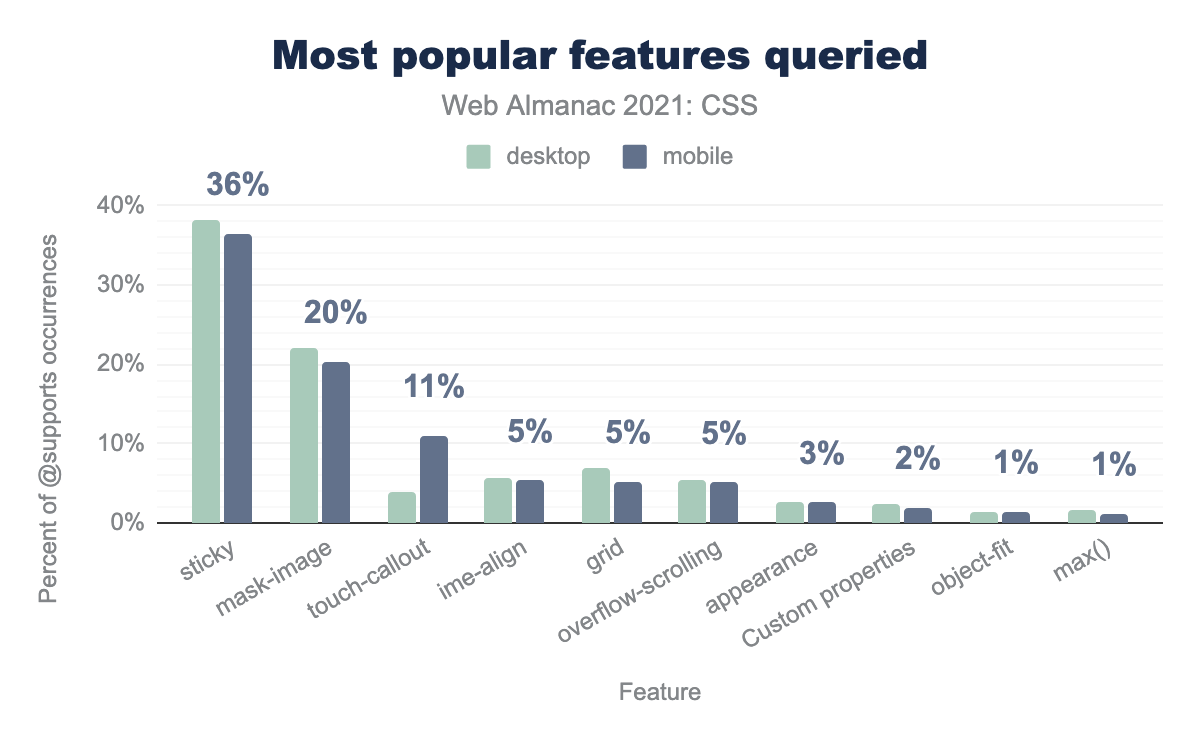
@supports). The sticky feature is accounts for 36% of usage, followed by mask-image 20%, touch-callout 11%, ime-align 5%, grid 5%, overflow-scrolling 5%, appearance 3%, custom properties 2%, object-fit 1%, and the max function 1%.As with last year, the most popular feature tested for in feature queries was position: sticky, however this has fallen from 53% to 36% of occurrences, perhaps due to the improved browser support for this feature.
Non-standard features show up strongly in these tests, with touch-callout (-webkit-touch-callout) and ime-align (-ms-ime-align). The former has grown in usage from 5% to 11%, while ime-align has dropped from 7% to 5%.
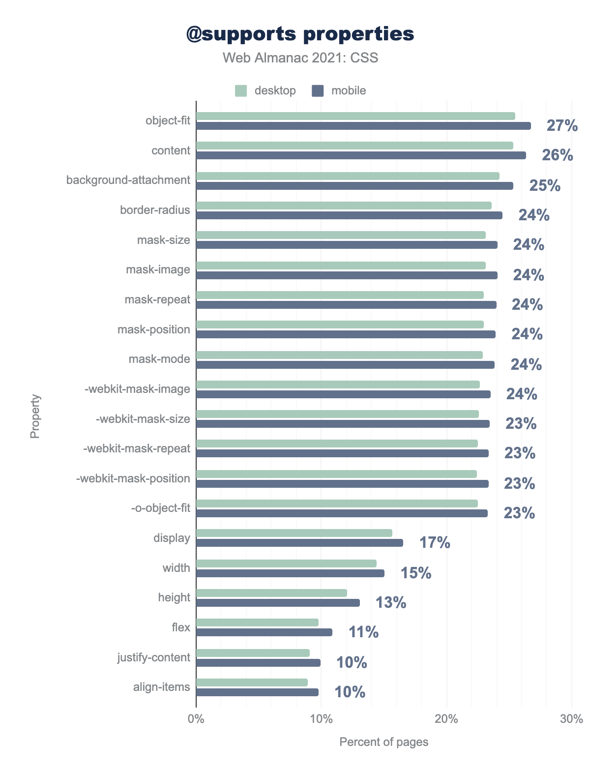
object-fit property is found in a feature query block on 27% of pages, followed by content 26%, background-attachment 25%, border-radius, mask-size, mask-image, mask-repeat, mask-position, mask-mode, and -webkit-mask-image 24%, -webkit-mask-size, -webkit-mask-repeat, -webkit-mask-position, and -o-object-fit 23%, display 17%, width 15%, height 13%, flex 11%, justify-content and align-items 10%.Having tested for support, which properties are then used inside these feature query blocks? The object-fit property came out top, the mask-* properties making a good showing, along with their -webkit-mask-* counterparts. This is likely due to the lack of interoperability for masking until recently, with the properties still requiring a -webkit prefix for Chrome.
While the display property features in the top 20, you have to go a long way down the list to find any grid properties. The grid-template-columns property being found in 2% of feature query blocks.
Internationalization
English is described as a horizontal top to bottom language, because sentences are written horizontally, starting at the top of the page. The script direction runs left-to-right (LTR). Arabic, Hebrew, and Urdu are also horizontal top to bottom languages, but have a script direction of right-to-left (RTL). There are also languages that are written vertically, from top to bottom, such as Chinese, Japanese, and Mongolian. CSS has evolved to better cope with these different writing modes and script directions.
Direction
The number of pages using the direction property to set CSS either on the <body> or <html> element remained unchanged from 2021, with 11% of pages setting it on <html> and 3% on <body>. It’s recommended to use HTML, rather than CSS to set direction, so a lower number here matches that best practice.
Logical and physical properties
Logical or flow-relative properties such as border-block-start and values such as start for text-align are useful for internationalization, as they follow the flow of text rather than being tied to the physical dimensions of the screen. Browser support for these properties is now excellent, so we wondered whether we would see more adoption.
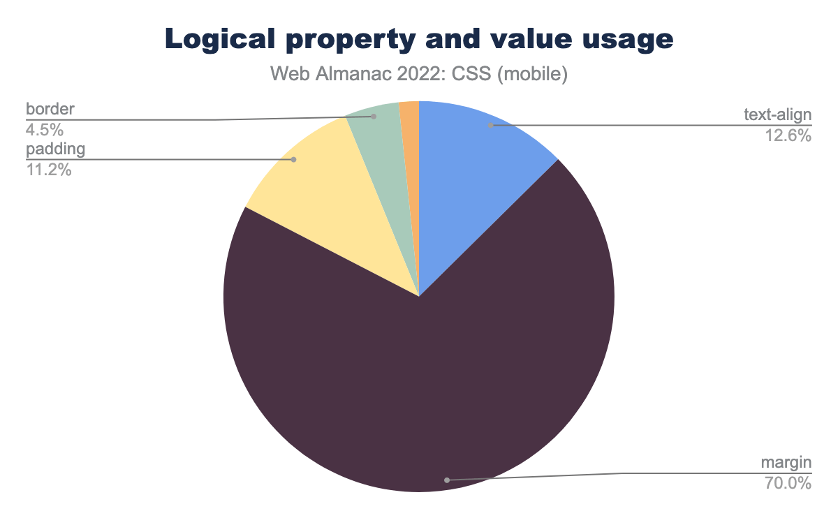
margin property is used 70.0% of the time, text-align 12.6%, padding 11.2%, border 4.5%, and inset 1.7%.Logical property usage has increased slightly from 2021, up from 4% to 5%. However, the chart for 2022 looks very different to the one for 2021. Overwhelmingly, people are using logical properties to set margin properties, up to 70% from 26%. The most popular margin properties are margin-inline-start and margin-inline-end, found on 9% of total pages. These are particularly useful for making sure that spacing between a label and following field, for example, works in the same way in a LTR and RTL script.
Ruby
Once again we checked for usage of CSS Ruby, a collection of properties used for interlinear annotation, which are short runs of text alongside the base text.
Its usage is still tiny, but has increased from 2021. In only 8,157 desktop pages and 9,119 mobile pages were found to be using it—less than 0.1% of all pages analyzed. This year, 16,698 desktop and 21,266 mobile pages—or 0.2% of all pages analyzed—were using it.
CSS in JS
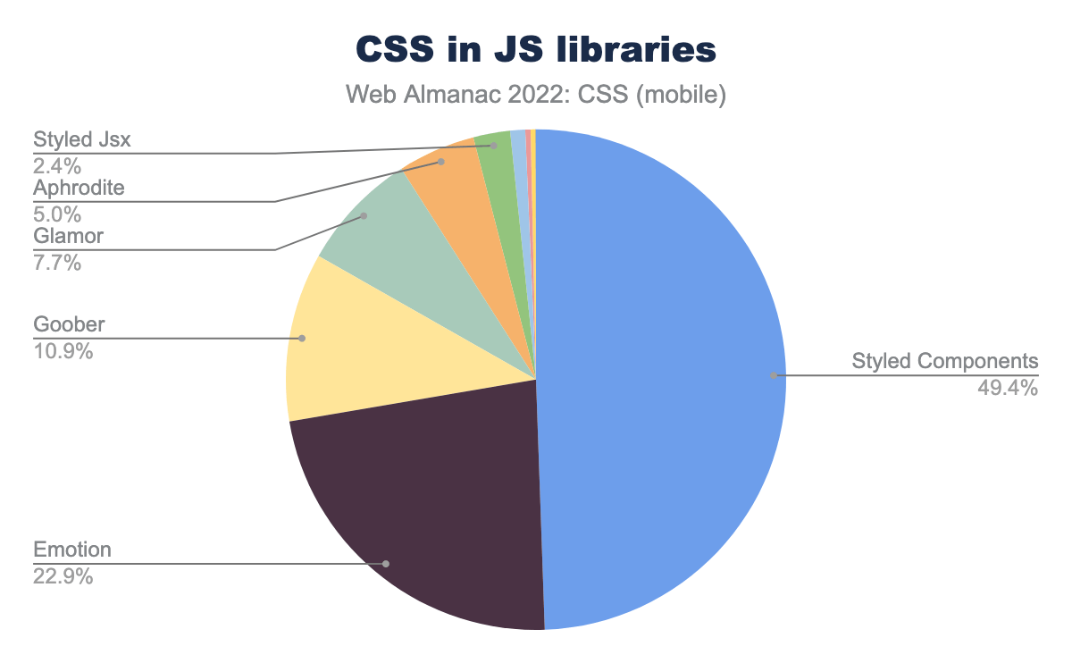
The use of CSS-in-JS has not increased from last year, staying at 3%. This usage is almost all from libraries, the most popular of which is Styled Components. This library has dropped in share from 57% to 49%, with a new library entering the mix at almost 11%. Goober describes itself as “a less than 1KB css-in-js solution”, and is certainly making some inroads among people who like this type of thing.
Houdini
There is still very little usage of Houdini on the open web. Looking at the number of pages using animated custom properties shows only a small increase since 2021. We also looked at usage of the Houdini Paint API. We do find instances of this in use on the web. By looking at the names of worklets used, much of this is the smooth corners worklet, indicating that people are using it as a progressive enhancement, given that this can fall back nicely to a regular border-radius.
Sass
Preprocessors like Sass can be seen as a good indicator of what developers want to be able to do with CSS, but can’t. And, with CSS increasing in power, a common question from developers is whether we need to use Sass at all. We can see from the rise in custom properties usage, that one common preprocessor use—the ability to have variables or constants—now has a built-in CSS equivalent.
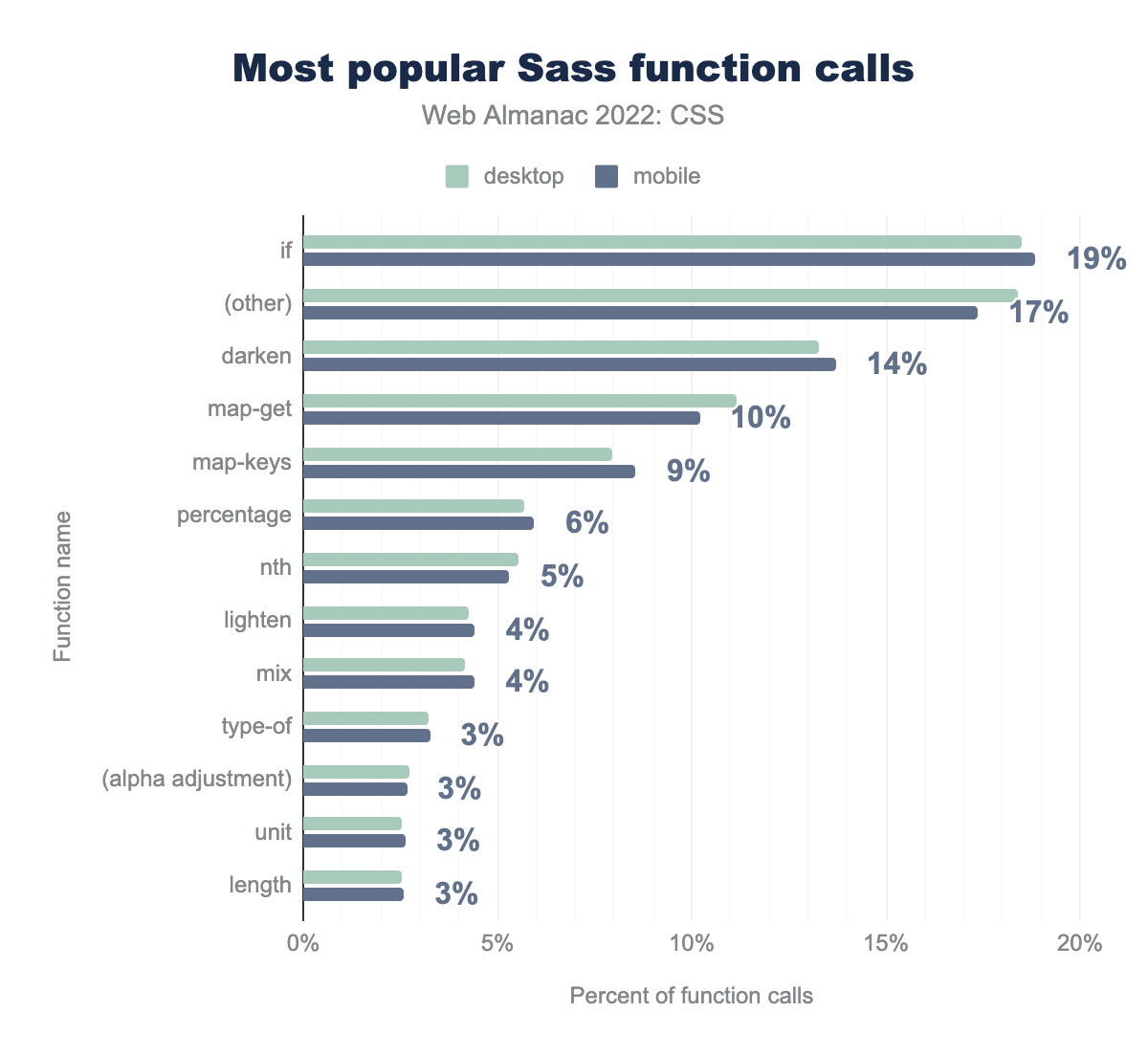
if function makes up 19% of Sass function calls, followed by other functions 17%, darken 14%, map-get 10%, map-keys 9%, percentage 6%, nth 5%, lighten and mix 4%, type-of, alpha adjustment, unit, and length 3%.Looking at the function calls shows that color functions are still a very popular use of Sass, something that may well soon be replaced with new CSS color functions such as color-mix(). There are some changes from last year. The darken function has dropped 2 percentage points to 14% and third place. The lighten function has, however, gained a points.
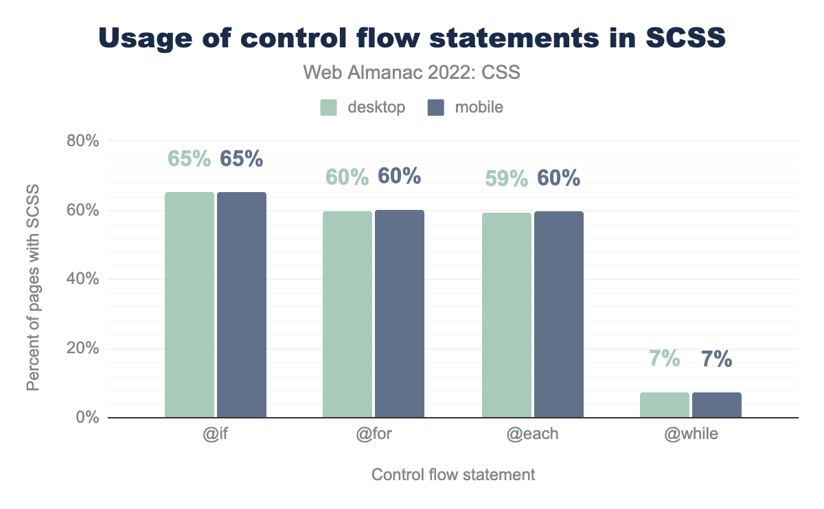
Looking at control flow statements we see a small increase in @for and @each, however @while has increased from 2% to 7%.
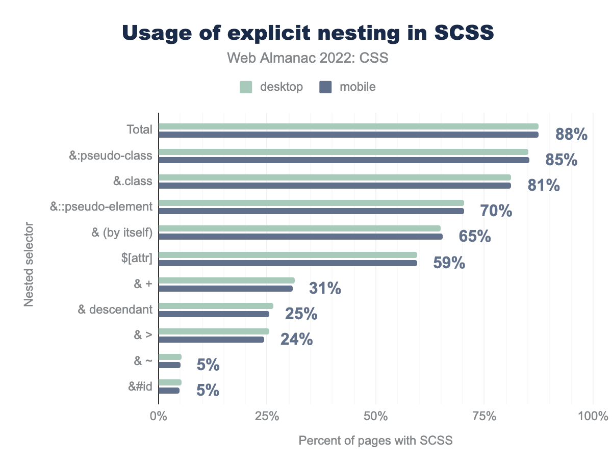
&:pseudo-class on 85% of SCSS pages, followed by &.class 81%, &::pseudo-element 70%, bare & by itself 65%, &[attr] 59%, & + (adjacent sibling) 31%, & descendent 25%, & > (child) 24%, & ~ and &#id 5%.Nesting is also interesting, given that a future spec for CSS Nesting is currently in development and discussion at the CSS Working Group. Nesting in SCSS sheets is very common, and can be identified by looking for the & character. As with last year pseudo-classes such as :hover, and classes such as .active make up most cases of nesting. All usage increased slightly, however & descendent increased 7 percentage points from 18% to 25%. Implicit nesting is not measured in this survey, as it does not use special characters.
CSS for print
We wondered whether developers were creating print stylesheets to provide a better printed experience, and only 5% of desktop and 4% of mobile sites were doing so.
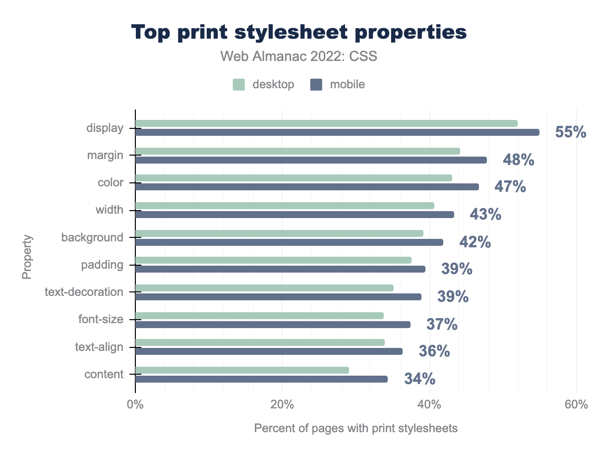
display property is used on 55% of pages with print stylesheets, followed by margin 48%, color 47%, width 43%, background 42%, padding and text-decoration 39%, font-size 37%, text-align 36%, and content 34%.Of the pages using print styles, over half changed the value of display—perhaps to simplify a grid or flex layout for print. We also see people changing colors, tweaking margin and padding, and setting the font-size. At 34% is the content property, used to insert generated content.
Print is a fragmented medium; the content is fragmented into pages, and we have a set of fragmentation properties that aim to give some control over how these breaks happen. For example, developers usually want to avoid a heading being the last thing on a page, or a caption being disconnected from the figure it relates to.
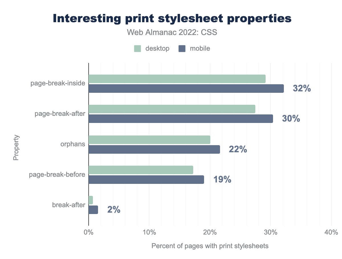
page-break-inside property is used on 32% of pages with print stylesheets, followed by page-break-after 30%, orphans 22%, page-break-before 19%, and break-after 2%.We see in this chart that many developers are using the old fragmentation properties of page-break-inside, page-break-after, and page-break-before, rather than the new properties such as break-before, which has very low usage.
The orphans property appears in 22% of print stylesheets, despite lacking support in Firefox. This property defines the number of lines that should be left at the bottom of a page before a fragmentation break. The widows property (which sets the number of lines on their own after a fragmentation break) is seen with around the same frequency. It is likely that people are setting the same value for both.
Paged media
There is an entire specification for dealing with Paged Media, and CSS for print. However, this has been poorly implemented in browsers. To find a good implementation of these features you need to use a print-specific user agent.
There is some browser support for the @page rule and its pseudo-classes, and we did find developers using these to set different page properties for the first page, and the left and right pages of a spread.
| Pseudo-class | Desktop | Mobile |
|---|---|---|
:first |
5,950 | 7,352 |
:right |
1,548 | 2,115 |
:left |
1,554 | 2,101 |
@page spread pseudo-classes.
Of people using these pseudo-classes, usage was mostly to set the page margins, and also the size of the page.
Meta
This section rounds up some general information about CSS usage, for example how often declarations are repeated, and common mistakes in CSS.
Declaration repetition
In 2020 and 2021, analysis was done to determine the amount of “declaration repetition”. This aims to identify how efficient a stylesheet is by looking for the number of declarations using the same property and value.
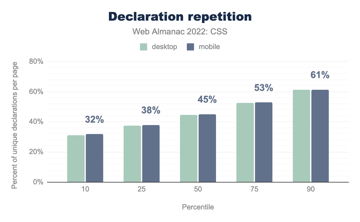
In 2021 it was reported there was a slight drop in repetition, this year there is a slight rise. This metric does therefore seem fairly stable year-on-year.
Shorthands and longhands
In CSS, a shorthand property is one that can set a number of longhand properties in one declaration. For example, the shorthand property background can be used to set all of the following longhand properties:
background-attachmentbackground-clipbackground-colorbackground-imagebackground-originbackground-positionbackground-repeatbackground-size
When developers mix shorthand properties like background and longhand properties like background-size in a stylesheet, it is always best to have the longhands come after the shorthands. We looked at instances of this to see which longhands were most common.
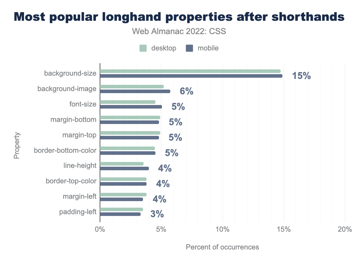
background-size property makes up 15% of this pattern, followed by background-image 6%, font-size, margin-bottom, margin-top, and border-bottom-color 5%, line-height, border-top-color, and margin-left 4%, and padding-left 3%.As in 2020 and 2021, background-size came out top of the chart, and there was little difference to be seen from 2021.
Unrecoverable syntax errors
As in previous years, we use the Rework engine for CSS parsing. An unrecoverable error is one where the error is so bad, the full stylesheet is unable to be parsed by Rework. Last year, 0.94% of desktop pages, and 0.55% of mobile pages contained an unrecoverable error. This year, 13% of desktop and 12% of mobile pages had such an error. This seems like a large jump, however due to some changes in methodology (adding size thresholds) it is likely that not all of the instances are unrecoverable errors.
Nonexistent properties
As in previous years we checked for declarations that had valid syntax, but referred to properties that don’t actually exist. This includes spelling errors, malformed vendor prefixes, and things developers have just made up.
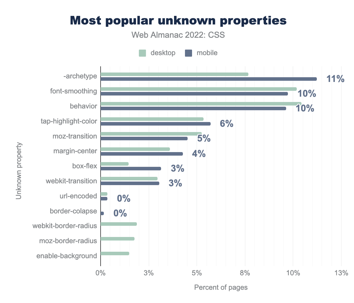
-archetype on 11% of pages, followed by font-smoothing and behavior on 10%, tap-highlight-color 6%, moz-transition 5%, margin-center 4%, box-flex 3%, webkit-transition 3%, and the remainder are all found on less than 1% of pages: url-encoded, border-collapse, webkit-border-radius, moz-border-radius, and enable-background.The top mystery property is -archetype, which is now appearing in 11% of cases of stylesheets with nonexistent properties. This property has jumped from 4% last year to 11% to take the top spot. The second property is font-smoothing with a drop of 4% points from last year. This appears to be an unprefixed version of -webkit-font-smoothing that does not actually exist. The use of the malformed webkit-transition (which should be -webkit-transition) has dropped from 14% to 3%. This makes us think it was perhaps getting into a large number of stylesheets via a framework or other third party that has since been updated to fix the problem.
Conclusion
CSS continues to evolve at a rapid pace, however we can see from the data that new features are adopted quite slowly, even when they have been in all major engines for several years. There are a few highly requested features, such as container queries, landing in browsers as of this writing. It will be interesting to see whether the uptake for these features will match the demand for them.
Something that has been apparent in this data is how much popular platforms, in particular WordPress, can impact usage statistics. We can see WordPress class and custom property names clearly in the data, but what is harder to see are the properties and values used by classes added to the majority of WordPress sites. If WordPress adopts a new feature, as part of one of these standard classes, we should expect to see a sudden uptick in usage.
As noted in last year’s conclusion, the data tells a story of gradual, steady adoption of new features (such as grid layout) or best practices (such as using logical rather than physical properties). We look forward to seeing how these changes develop in the years to come.
